The Heirloom Collection: 8 Palettes That Make Color Feel Easy (and Expensive)
If you’ve ever stood in the paint aisle holding 37 swatches like you’re about to take the SAT again… welcome! This is exactly why I build color palettes.
Color gets a bad reputation because most people meet it at its worst: under fluorescent lights, in the paint aisle, while holding a swatch that looks “perfect”… until it gets home and starts acting brand new. That’s exactly why I created the Heirloom Collection; a set of palettes designed to take the guesswork out of choosing colors that actually work together in real homes, in real light, with real furniture and fixed finishes.
A well-built palette does more than look pretty. It gives you a structure. It helps you create flow from room to room, avoid clashing undertones, and make confident decisions faster. Because you’re not starting from scratch every time you paint a wall. If you’ve used my guides before (sampling + testing, undertones, sheen selection, and the room-by-room planning method), you already know the approach: assign each color a role, test it properly, and repeat the system so the whole home feels intentional.
Now let’s meet the eight.
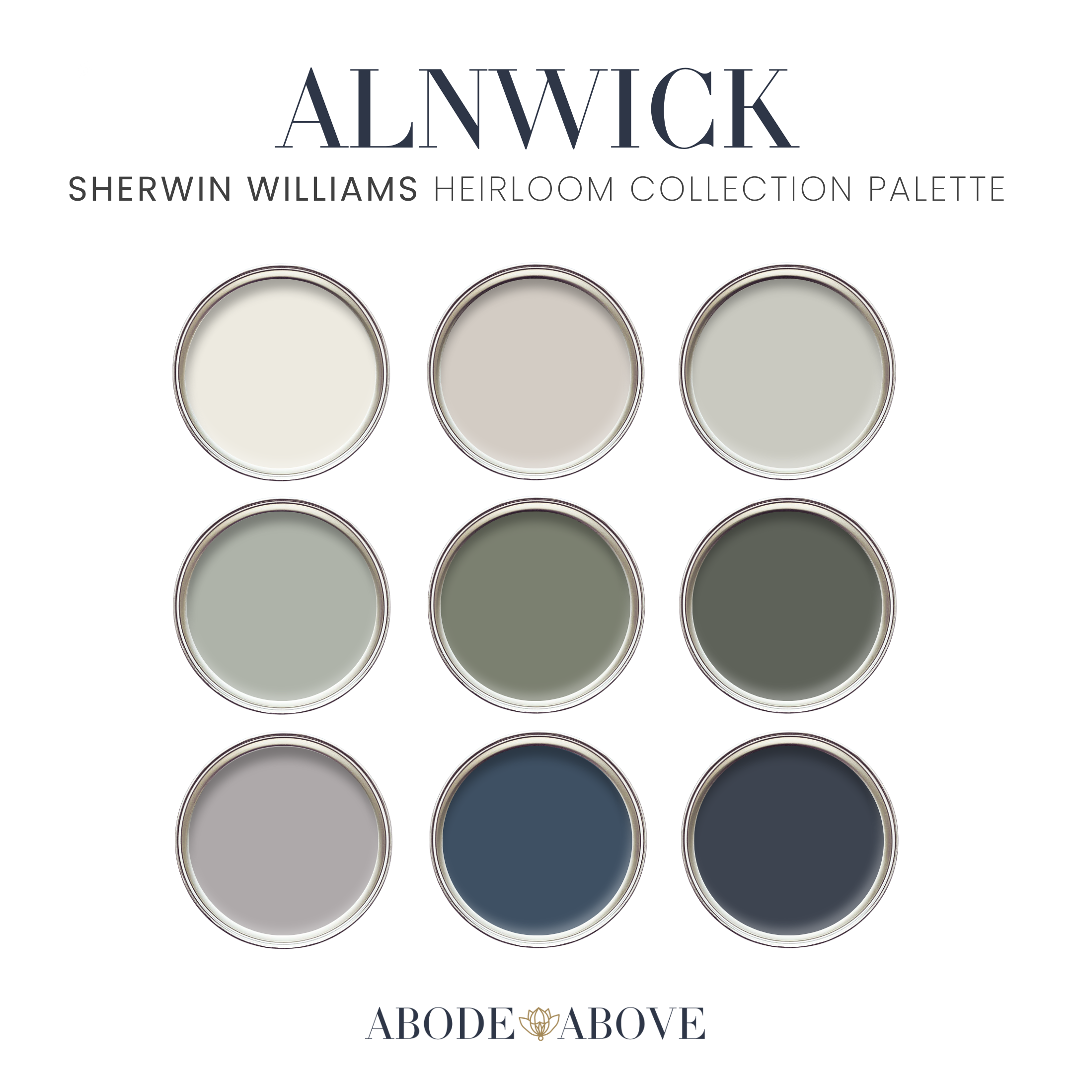
ALNWICK: A Warm Heritage Palette With a Quiet Dramatic Streak
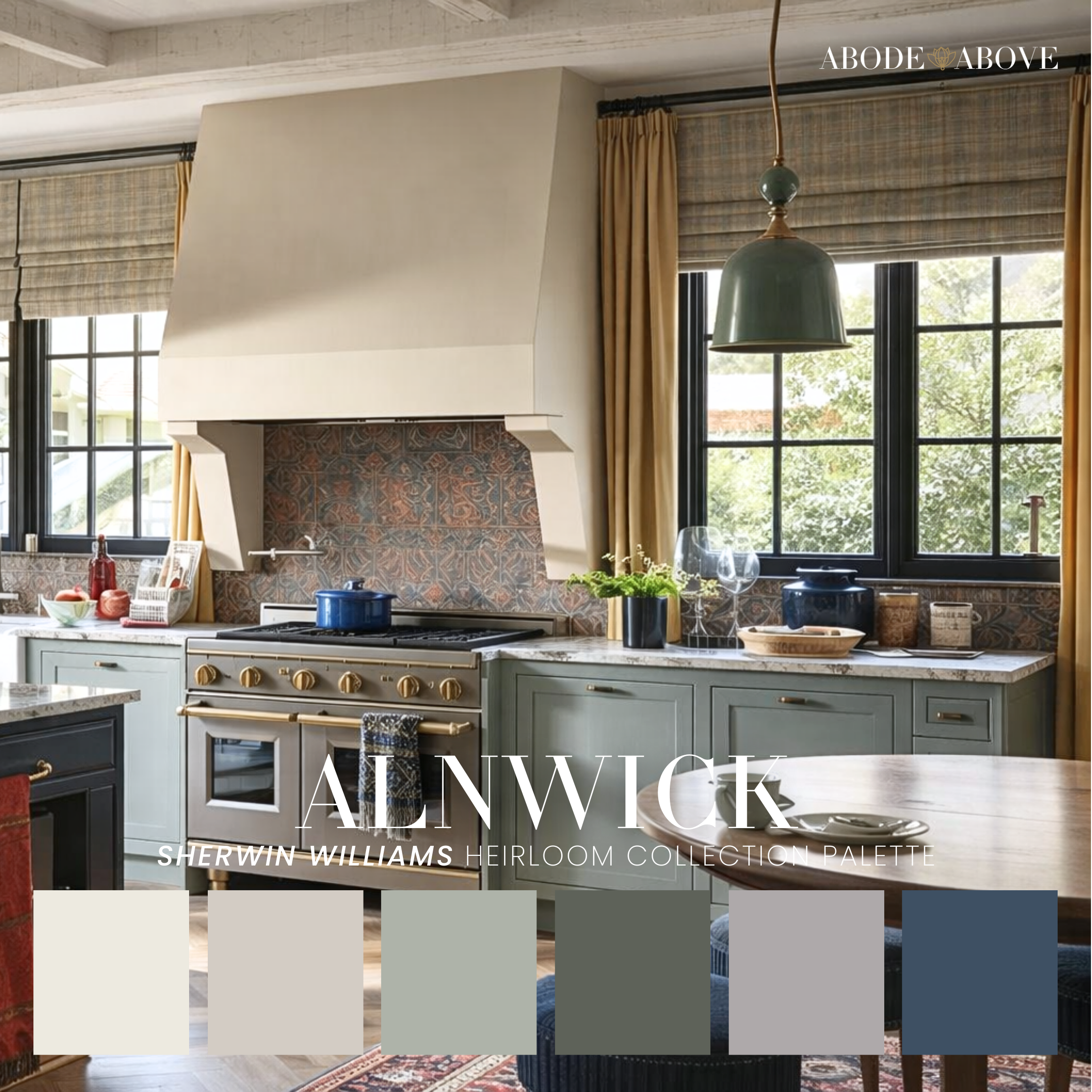
Alnwick feels like walking into a kitchen that’s been loved for years; where the light is soft, the finishes have depth, and nothing feels overly “done.” It’s grounded in warm neutrals, but it doesn’t stop at safe. This palette has those creamy, comfortable tones that make a space feel welcoming the moment you step in, paired with deeper, heritage-leaning hues that give the whole look structure. If your style lives somewhere between traditional and modern—think transitional, European cottage, organic modern with vintage edges—Alnwick will feel like a natural fit.
In a home, I love Alnwick most when it’s used to create a sense of permanence. Picture your main walls in the lightest neutral—something that reads clean and airy without being stark—then let the deeper shades take the lead in the places that deserve weight: an island, lower cabinetry, a built-in hutch, even interior doors. The magic is how it plays with materials. Warm oak floors? Gorgeous. Aged brass hardware? Even better. Handmade tile or a stone backsplash? Alnwick makes those choices look expensive and intentional.
If you’re someone who wants your home to feel cozy but elevated—and you’re not interested in chasing trends—this palette gives you that “it’s always looked this good” energy. It’s inviting, but with a backbone.
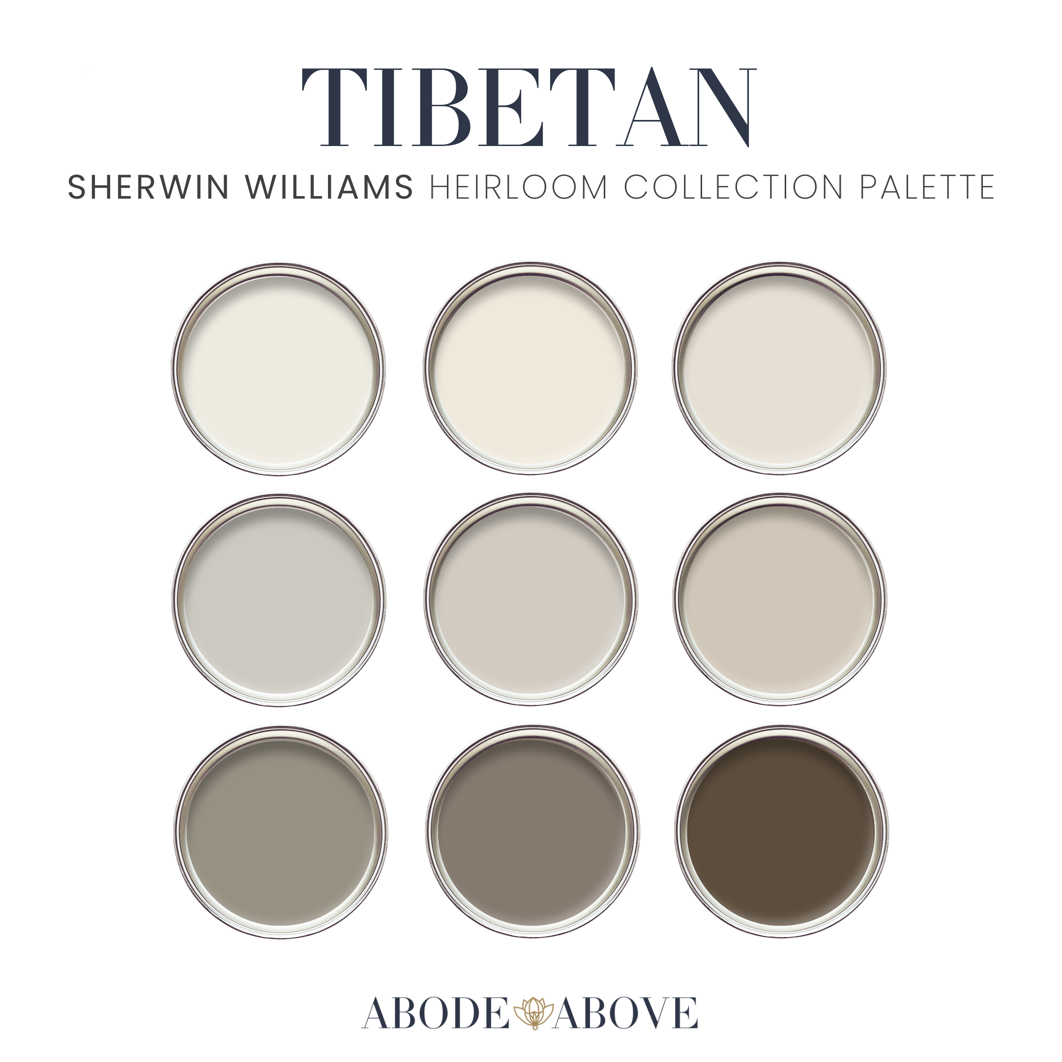
TIBETAN: The Soft, Grounded Neutral Palette for People Who Want Peace (and Still Want Style)
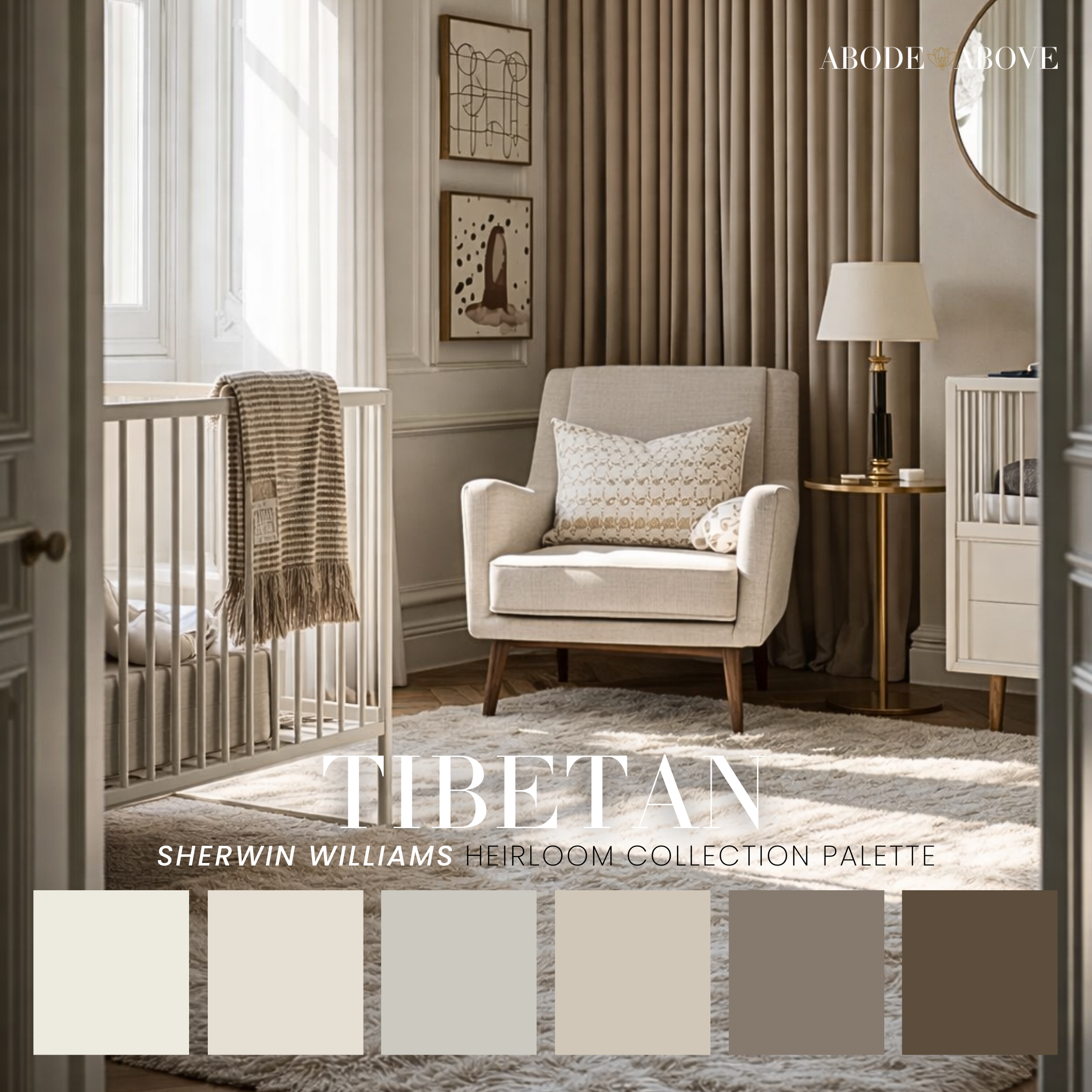
Tibetan is for the person who wants their home to feel like a deep breath. It’s warm, layered, and quietly sophisticated—built on creamy ivories, soft almond and taupe, sandy beige, warm greige, and a rich cocoa note that keeps everything from floating away. If you’ve ever tried a “neutral” that ended up looking flat, cold, or strangely purple at night… Tibetan is your reset.
What makes Tibetan special is that it creates calm without turning your home into a blank box. The tones are warm, but they’re not yellow. They’re soft, but they’re not washed out. And because the palette includes deeper grounding shades, you can create contrast without needing a “color moment” that feels loud. In practice, Tibetan is stunning in open-concept spaces where you want flow—walls in one of the lighter tones, trim kept consistent, and then the cocoa or mushroom taupe reserved for cabinetry, an accent wall, or a piece of furniture you want to anchor the room.
This palette also excels in bedrooms, nurseries, and primary suites because it supports rest. Imagine linen drapery, warm wood nightstands, soft lighting, and a wall color that looks creamy in the morning and cozy at night. Tibetan gives you that cocoon effect—serene, refined, and deeply livable. If you’re transitioning away from cool grays and want warmth done well, this palette will feel like home instantly.
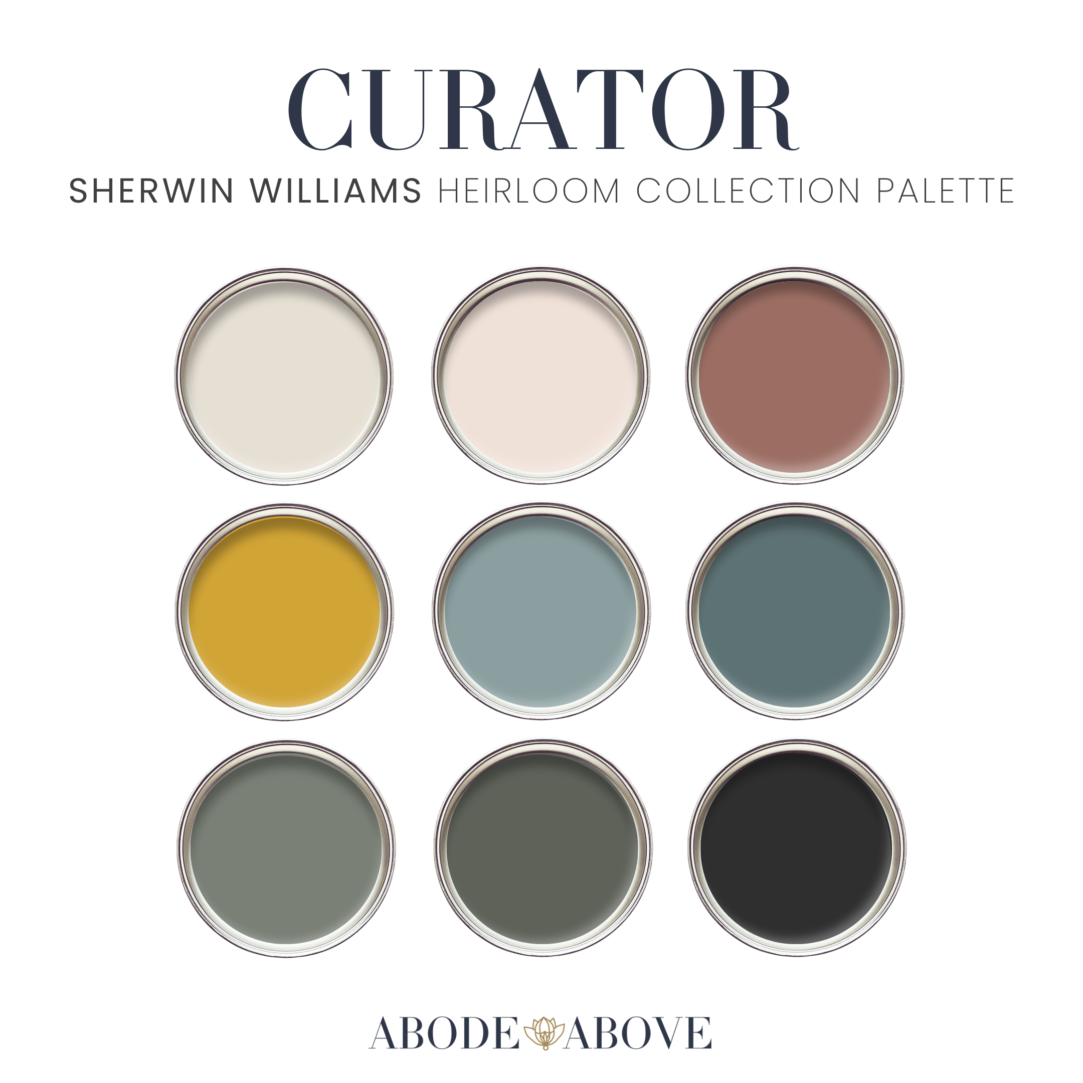
CURATOR: Color Confidence for the Person Who Likes Their Home to Have Personality
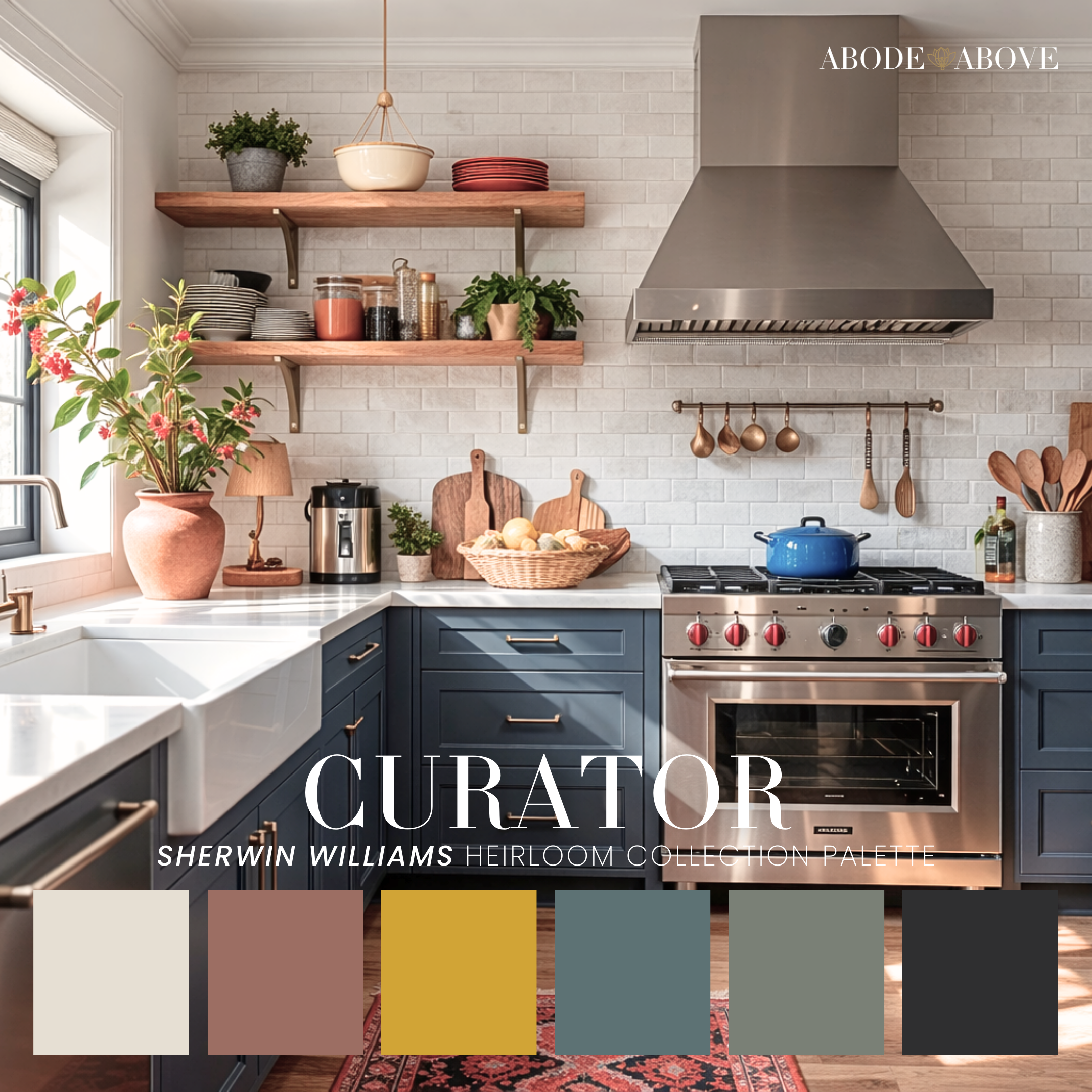
Curator is the palette for the creative thinker—the one who appreciates design, collects pieces with meaning, and wants a home that feels curated instead of cookie-cutter. This is not a timid palette, but it’s not chaotic either. It’s balanced. It has bright, clean neutrals to keep things grounded, then richer tones that add energy: a deep blue that reads classic and bold, warm earthy notes that feel collected, and that golden touch that brings in warmth without feeling “theme-y.”
In a home, Curator works beautifully when you let the neutrals do the heavy lifting and use the bold tones strategically. Think: a kitchen with a light wall color and deep blue cabinetry—immediately elevated, instantly memorable. Or a dining room where the walls stay soft and neutral, but the story comes through in your rug, artwork, and textiles—pulling in the warmer accents from the palette so the space feels alive.
Curator is also a dream for offices and studios because it stimulates creativity without feeling busy. A deep blue on built-ins or a desk wall creates focus. Warm accents show up in your lighting, art frames, and textiles. And that’s the key: this palette looks designer when you repeat each accent more than once. The quickest way to make a bold palette feel “off” is to use a statement color only one time. Curator thrives on intentional repetition; like good styling, not random shopping.
If you want color, but you want it to look grown and curated, Curator is your palette.
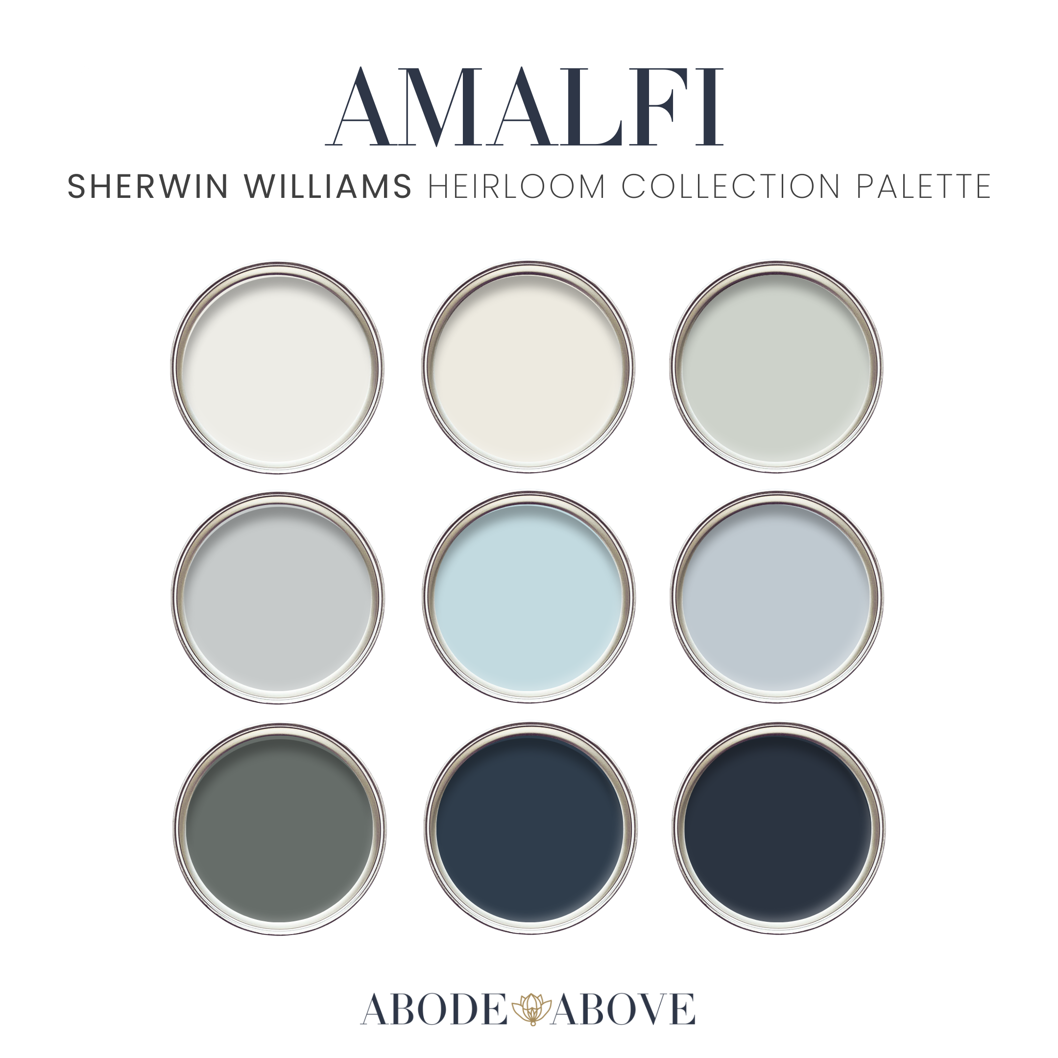
AMALFI: Light, Airy, and Coastal Without Looking Like a Beach Souvenir Shop
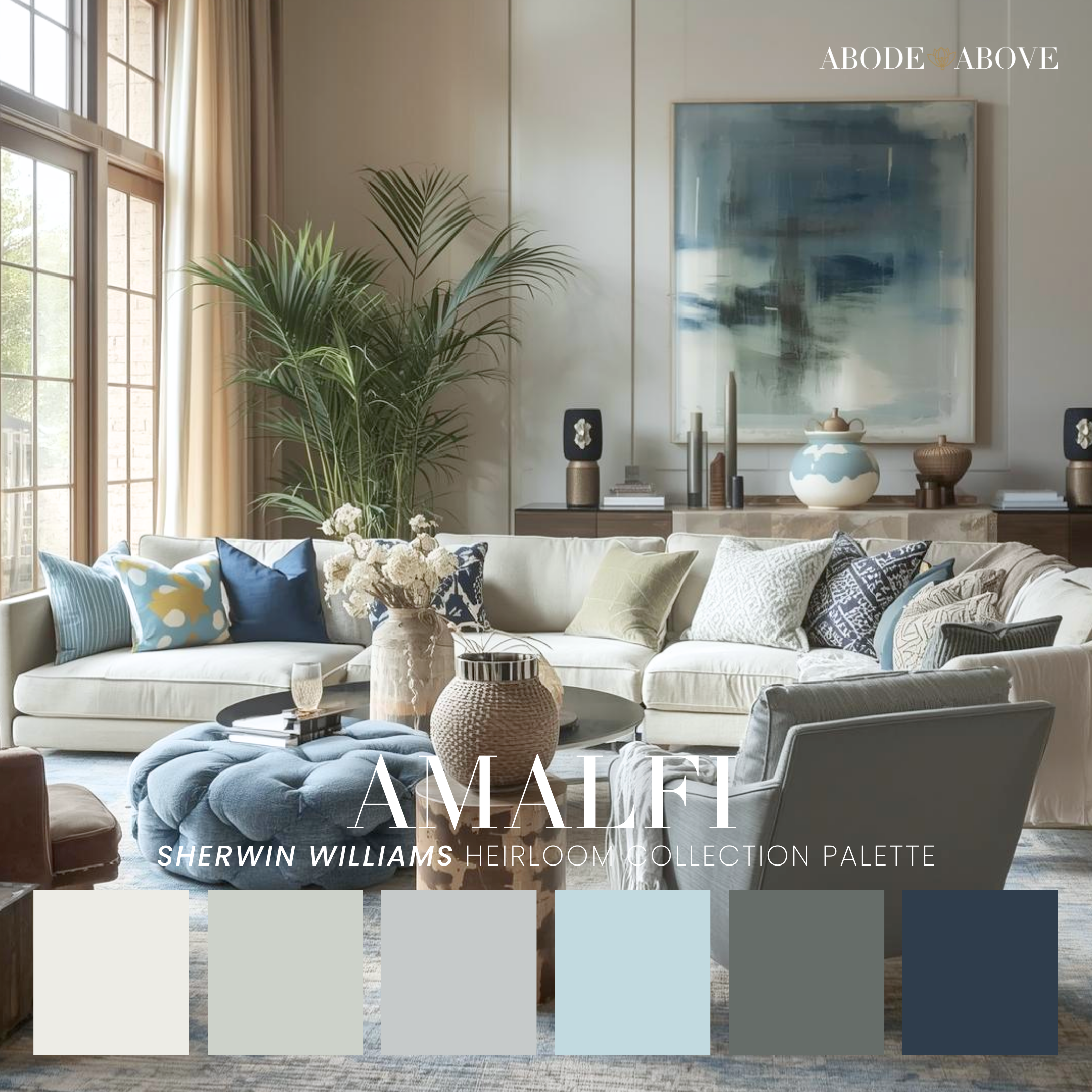
Amalfi is what people usually mean when they say they want a space to feel “fresh.” It’s airy without being cold and coastal without being cliché. The palette blends creamy neutrals with watery blues and grounded gray-green tones, creating a look that feels relaxed, elevated, and naturally bright. It’s the kind of palette that makes a room feel sunlit, even when it’s not.
In real homes, Amalfi shines in living rooms and sunrooms where you want a soft, welcoming vibe that still feels polished. Picture a creamy wall color that keeps everything warm and light, paired with soft blue accents in pillows, art, or a statement chair. The gray-green tones are your secret weapon here; they provide a grounded, sophisticated counterbalance so the palette doesn’t float into “too pale” territory. They’re perfect for built-ins, a vanity, or even interior doors if you want a subtle color moment that still reads timeless.
Bathrooms are another perfect match for Amalfi. If you have light stone, warm metals, or classic tile, Amalfi supports those finishes beautifully. It also pairs well with natural textures: woven baskets, light oak, linen shower curtains, so the space feels layered and lived-in instead of showroom sterile.
This is the palette for someone who wants their home to feel optimistic and breezy, but still designer and intentional. If you’re drawn to calm spaces with gentle color, Amalfi delivers.
CHATEAU: Tailored, Moody, and Elegant—Without Needing a Dozen Colors
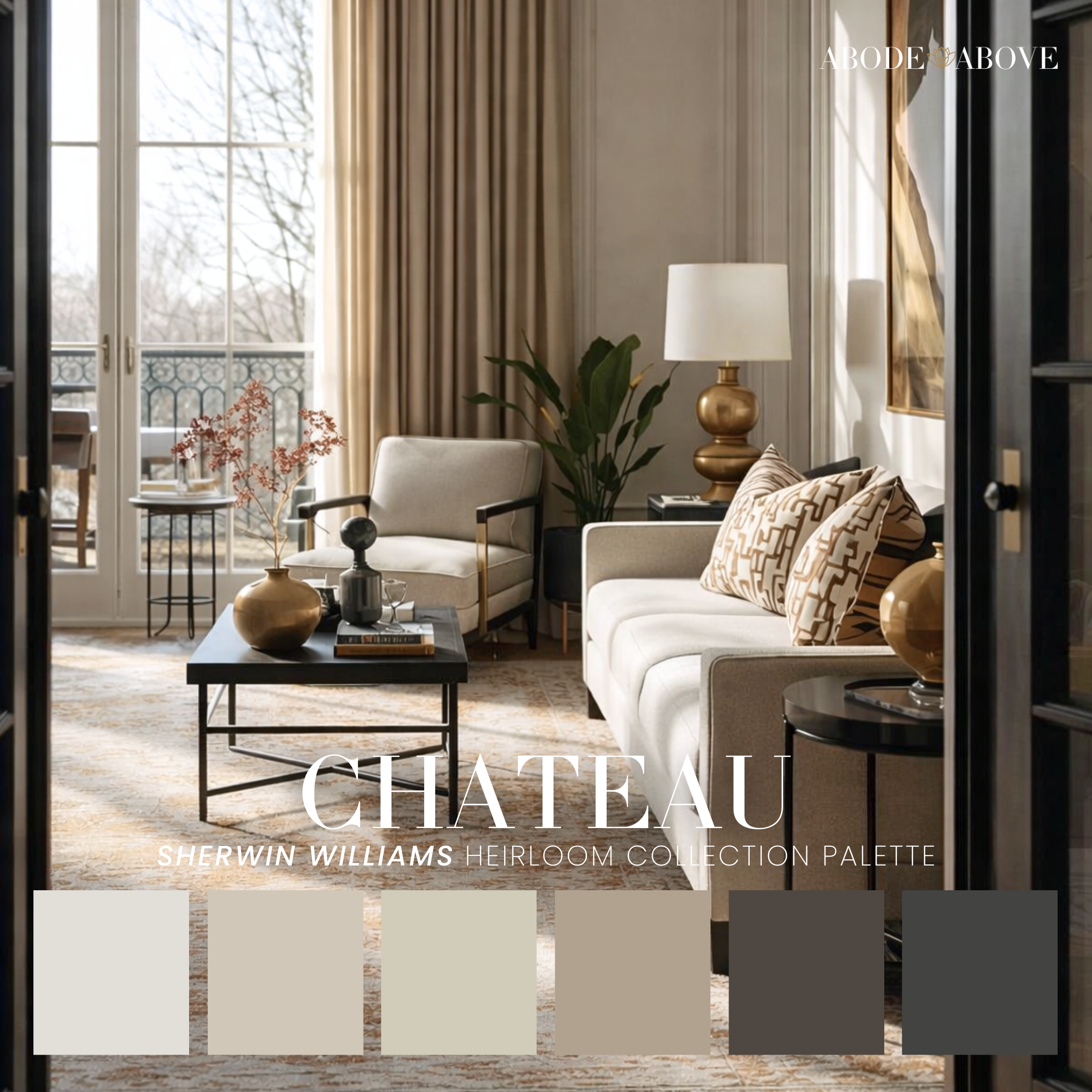
Chateau is for the person who loves a classic, slightly dramatic interior. It’s not loud, but it is confident. The palette leans into warm neutrals supported by deep charcoals and richer grounding tones—creating rooms that feel polished, tailored, and quietly bold. This is the palette version of a well-cut blazer: simple on the surface, powerful in execution.
Chateau works best when you embrace contrast. Let your walls live in the lighter neutrals so the space stays bright and open, then bring in depth through architectural moments: interior doors, built-ins, a fireplace surround, or a single feature wall that anchors the room. It’s especially stunning in dining rooms and entryways, where you want that immediate “wow” without resorting to overly trendy choices. Even a powder room becomes instantly elevated with this palette because the deeper tones create intimacy and mood.
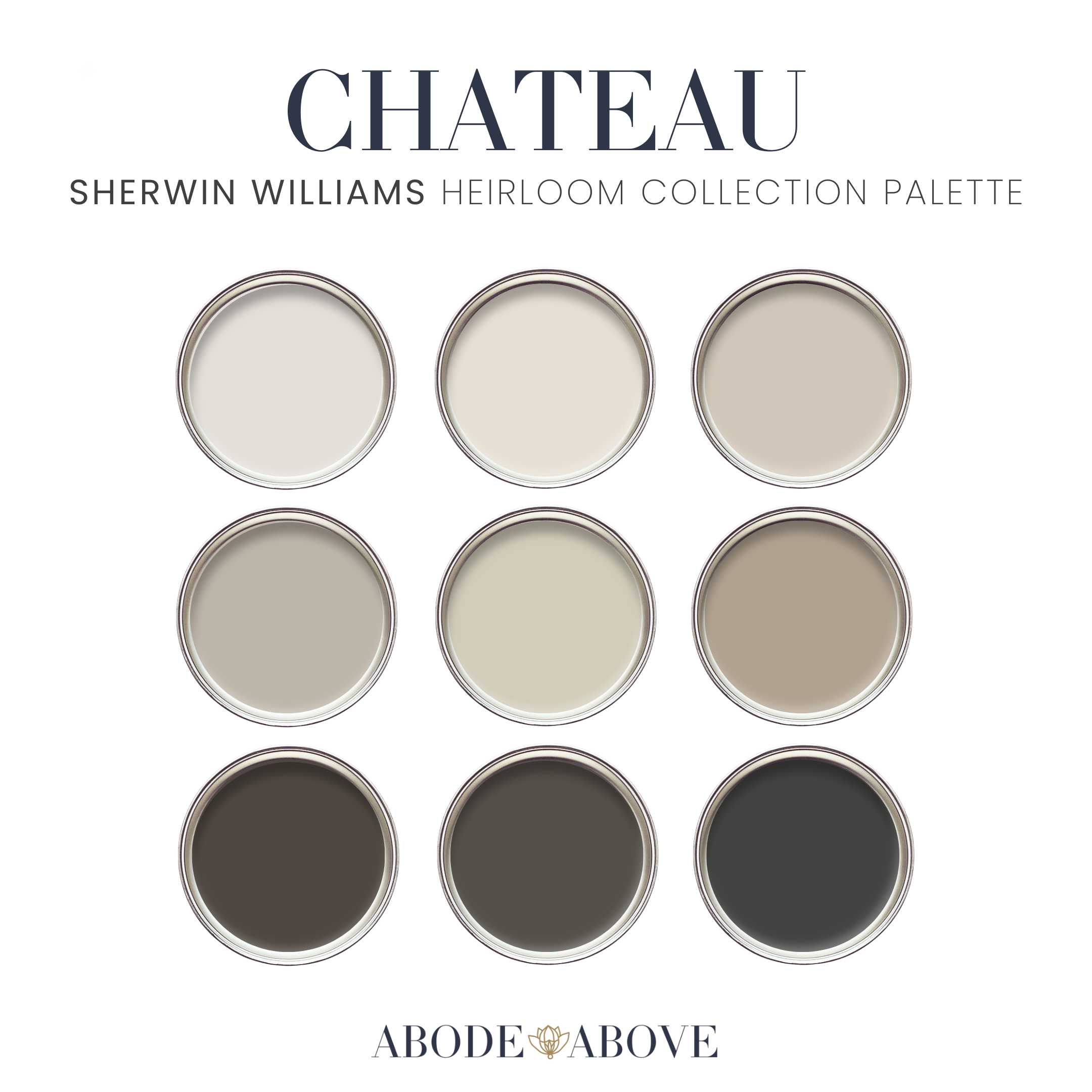
The trick to Chateau is lighting. Warm, layered lighting makes this palette glow… table lamps, sconces, warm bulbs. Pair that with natural textures (wood, stone, linen) and warm metals like aged brass, and the whole room reads expensive without trying too hard.
Chateau is ideal for someone who likes a refined look, appreciates a little drama, and wants their home to feel intentional and elevated, without feeling busy.
WILLA: Soft, Romantic, and Modern—For Homes That Want Warmth Without “Boring Beige”
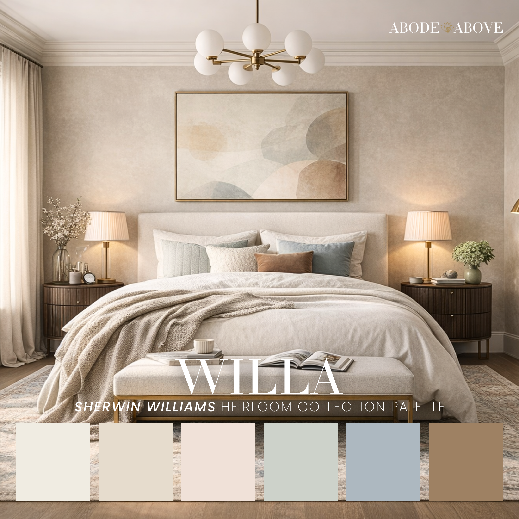
Willa is gentle in a way that still feels designed. It’s a soft, modern romantic palette built on warm neutrals with subtle blushy undertones, calm muted greens, and a quiet blue-gray note that adds sophistication. Willa doesn’t scream for attention—it invites you in. And if your goal is for your home to feel comforting and pretty without feeling overly sweet, this palette is your best friend.
In bedrooms, Willa is a dream. Imagine warm, creamy walls that make the light feel flattering, not harsh. Add bedding in layered neutrals, then bring in the softer colors through pillows, throws, or artwork; just enough to create warmth and personality. The muted green/blue tones are perfect for furniture or cabinetry: a dresser, a vanity, or even a built-in nook that needs definition.
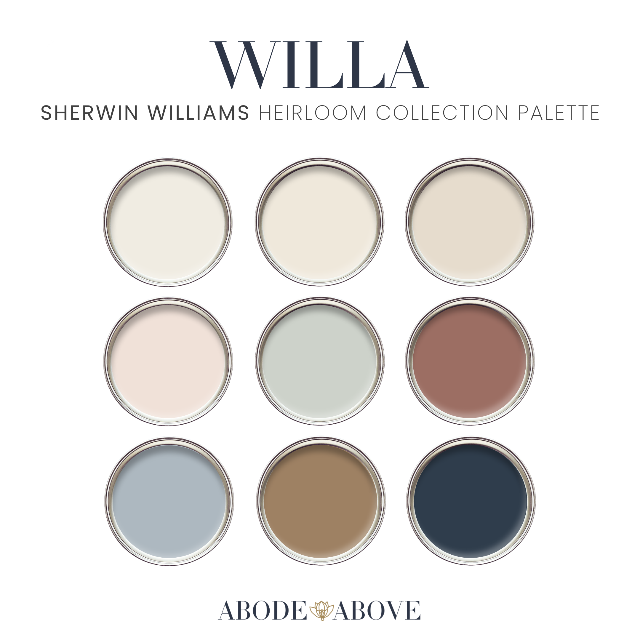
Willa is also fantastic for nurseries and guest rooms because it reads calm and welcoming. It has that “hotel softness” energy: gentle, elevated, and timeless, especially when paired with natural wood tones and warm metals. I also love Willa for dressing rooms and reading corners because it makes small spaces feel soothing instead of tight.
This palette is for the person who wants their home to feel like a soft landing… still polished, still intentional, just a little more tender.
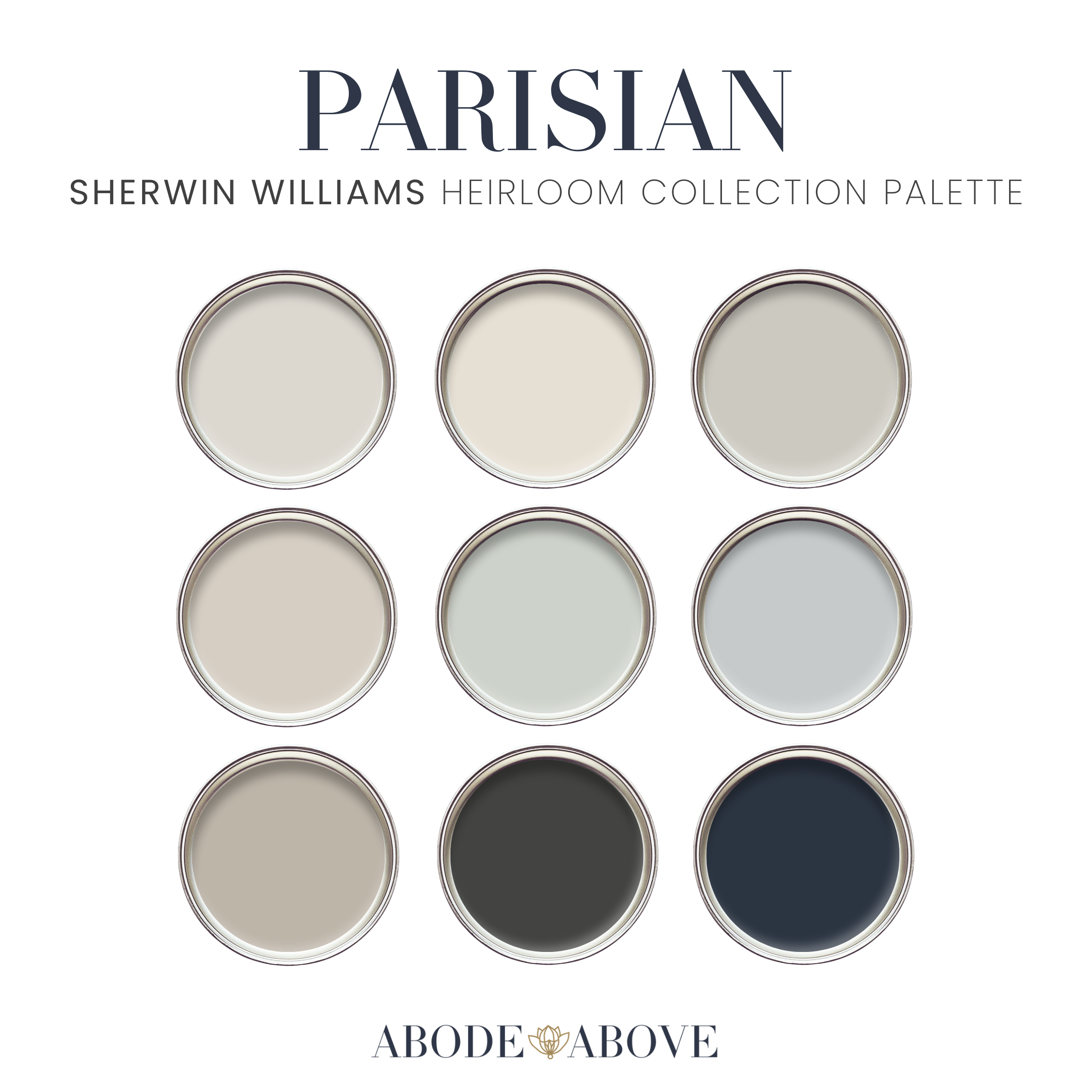
PARISIAN: Clean, Chic Neutrals with a Classic Deep Blue Anchor
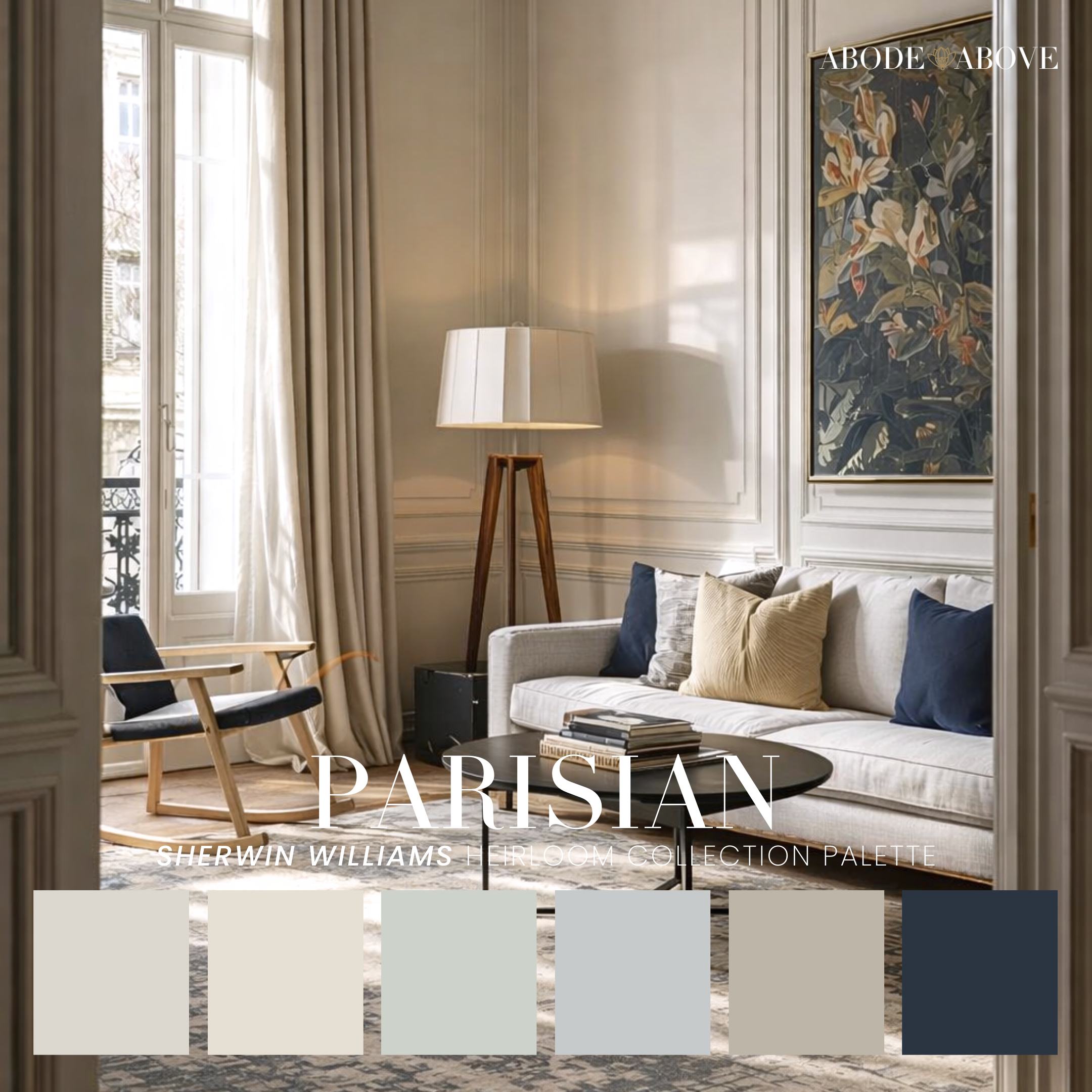
Parisian is effortless in the way that true style always is. It’s a crisp, tailored palette of pale neutrals and soft grayed tones, anchored by a deep blue that brings structure and sophistication. This palette feels polished and elevated, but it also gives you flexibility, because the neutrals can shift warm or cool depending on your finishes, and the deep blue adds that timeless contrast that always works.
In living rooms, Parisian creates a clean foundation that makes your furniture and styling look intentional. The walls can stay light and refined, allowing natural light to bounce around the room. Then the deep blue shows up as the anchor: built-ins, a front door, a powder room vanity, lower kitchen cabinetry, or even a dining room accent wall. It’s bold, but classic… so it doesn’t feel trendy.
Parisian also works beautifully in homes with architectural details: millwork, wainscoting, higher ceilings, because the palette supports that classic structure. Pair it with warm woods, brass accents, and black details, and the look is instantly designer. It’s the palette for someone who wants their home to feel put-together without being precious. You like clean lines, thoughtful contrast, and a space that looks good with minimal effort.
If you’ve ever said, “I just want it to feel elevated,” Parisian is a very good place to start.
LONDON: Urban, Moody, and Confident… For the Person Who Wants Their Home to Feel Like a Vibe
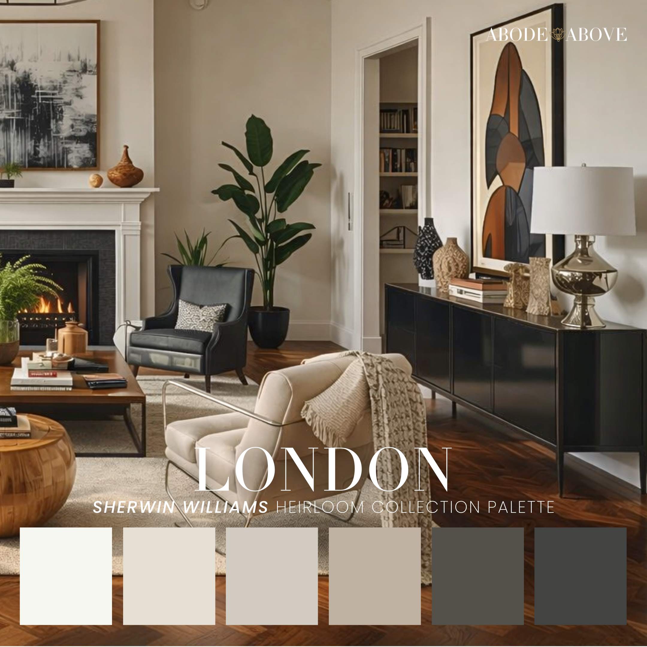
London is bold, editorial, and grounded. It’s built on light neutrals with smoky taupes and deeper charcoals that create instant mood and sophistication. This palette is for the person who wants their home to feel intentional and confident; the kind of space that looks pulled together, even on a random Tuesday.
In a living room, London creates depth without making the space feel heavy. The key is balance: keep your walls in the lighter neutrals to maintain brightness, then bring in the darker tones through built-ins, a fireplace surround, interior doors, or cabinetry. That contrast is what makes the palette feel elevated. It’s not about painting everything dark—it’s about using darkness strategically, like eyeliner. A little goes a long way, and suddenly everything looks sharper.
London is also excellent for offices and media rooms because it creates focus and drama. Pair it with warm wood tones, layered lighting, and textiles that soften the edges (rugs, drapery, cushions), and the space feels rich rather than cold. One honest note: this palette will expose bad lighting fast. If your bulbs are too cool, London will look flat. Warm bulbs and layered lamps are non-negotiable here.
If you like modern classic design, moody contrast, and spaces that feel “designer” the second you walk in, London is your palette.
Ready to Use These Palettes in Your Own Home?
Whether you’re drawn to the calm warmth of Tibetan, the confident contrast of London, the soft romance of Willa, or the curated energy of Curator, the point of the Heirloom Collection is simple: make color feel doable—and make your home feel intentional. The palette gives you the plan. Your job is just to apply it with confidence (and yes, test first—my guides will back you up).
If you’re ready to bring one of these looks home, check out the full Heirloom Collection palettes—and more curated palettes—in our Etsy shop.