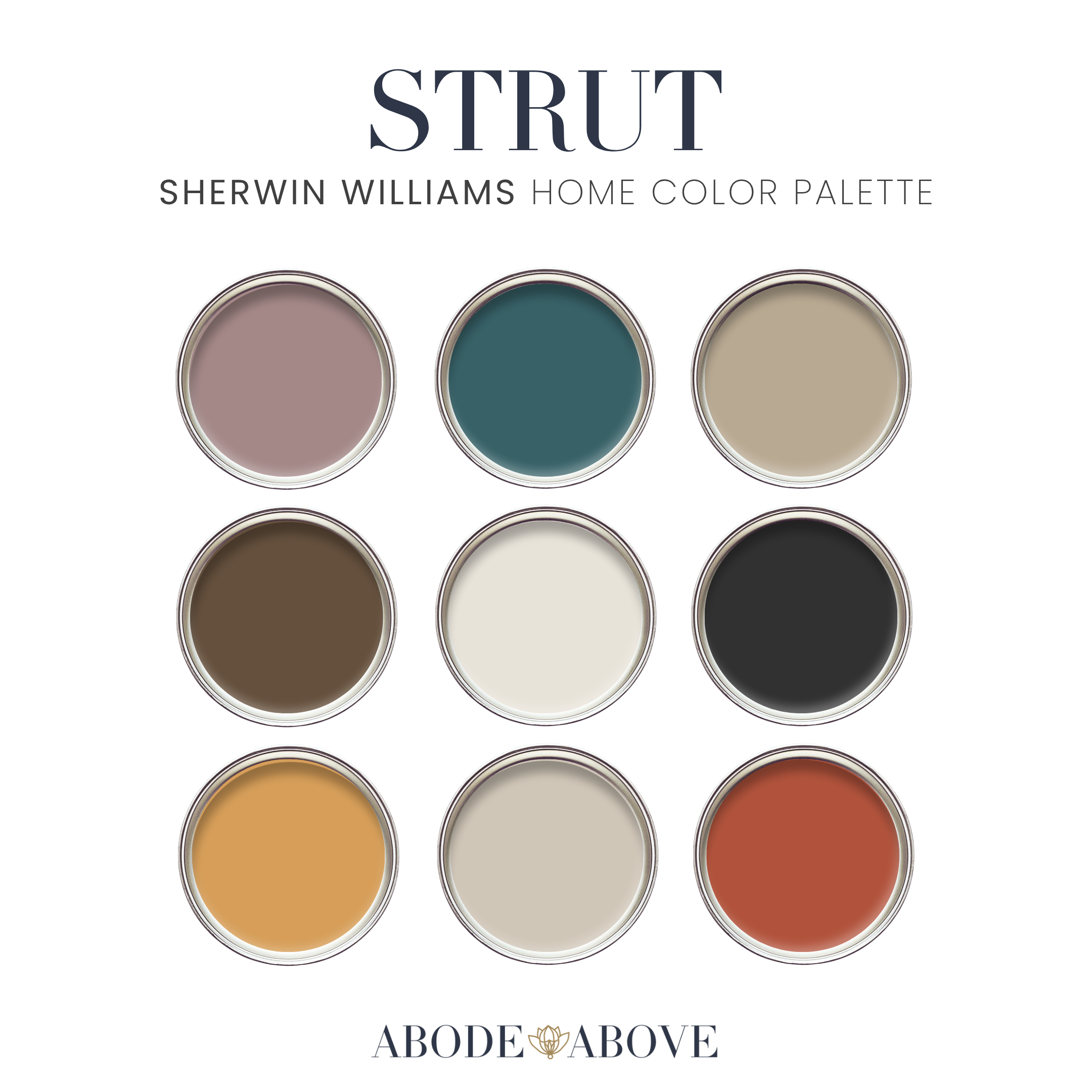
STRUT: The Color Palette That Knows Where It’s Going
Strut is not a quiet palette. It doesn’t whisper or wait to be discovered. It walks into the room fully formed, confident, and intentional. This palette was built around the idea that color can be grounded and expressive at the same time. It borrows from fashion houses that understand proportion, contrast, and restraint, and from mid-century modern interiors that mastered the art of boldness without chaos.
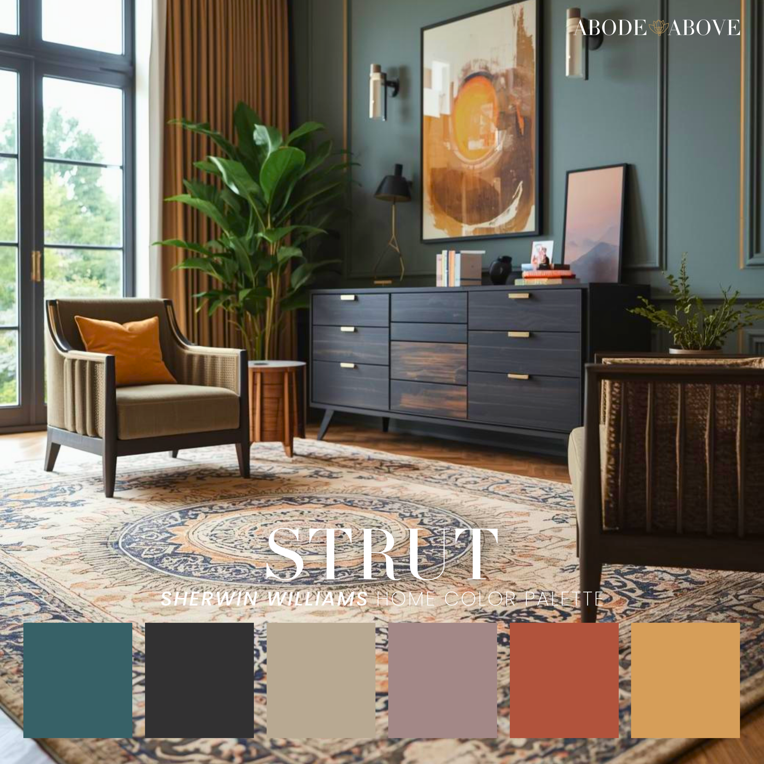
At its core, Strut is about balance. You’ll notice the palette anchors itself with deep charcoal and soft, creamy neutrals. These are your tailoring pieces, the equivalent of a perfectly cut blazer or a crisp trouser. They create structure. Around them, you see saturated earth tones, a moody blue-green, a rich camel, and a warm rust that feels sunbaked and soulful. Together, these colors feel curated, not trendy. They have staying power.
Mid-century modern influence shows up here in the confidence of the color choices. Think walnut credenzas, sculptural furniture, and graphic rugs that knew how to hold space without apology. This palette honors that era’s love of contrast and materiality. The darker hues ground a room, while the lighter khakis and creams keep things breathable. Nothing floats away. Nothing feels heavy for the sake of drama.
From a fashion perspective, Strut behaves the same way a strong outfit does. You don’t wear every statement piece at once. You build a look. One bold color leads, another supports, and the rest frame the moment. That’s exactly how this palette works best in a home.
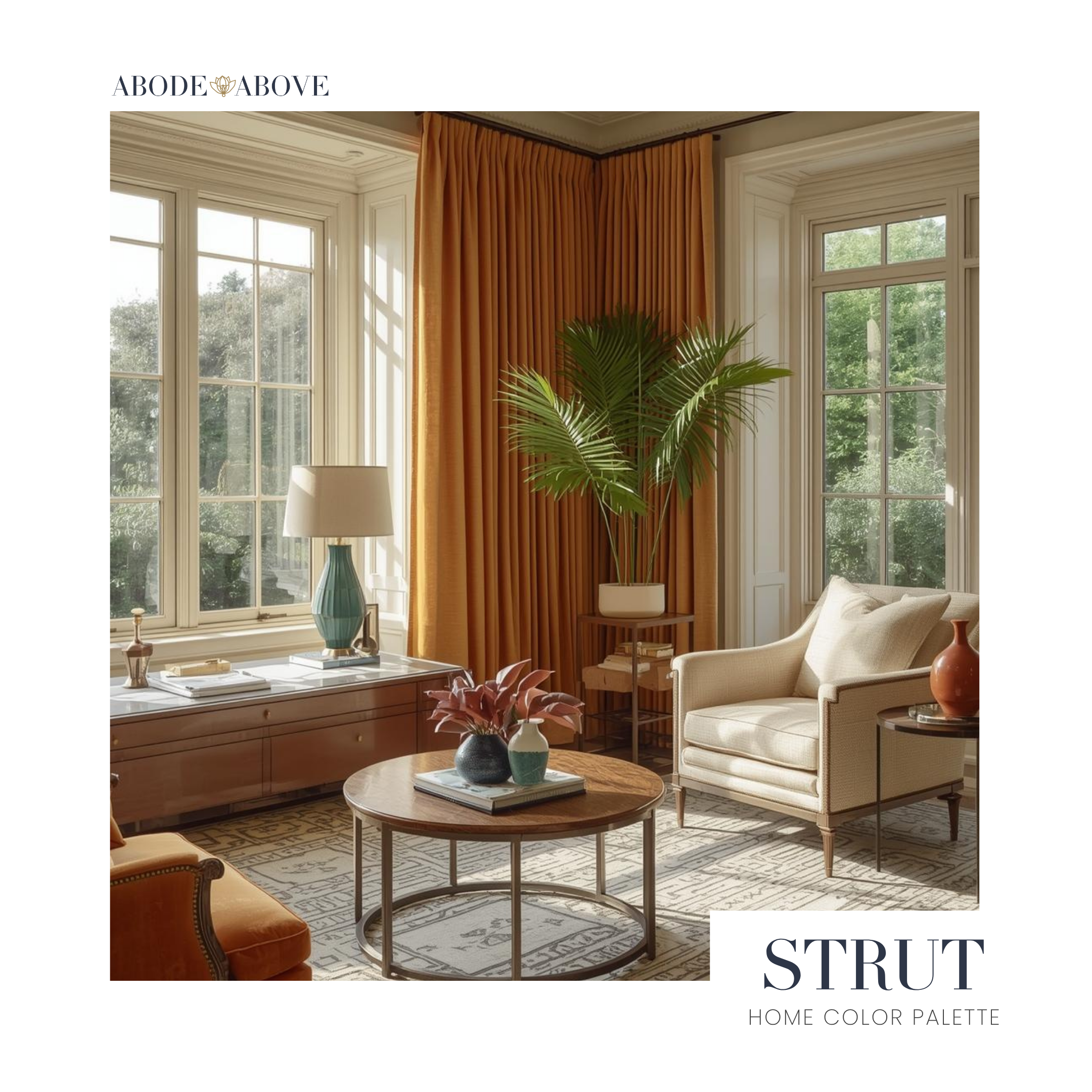
Let’s talk about application, because this is where people tend to overthink. Start by choosing one grounding neutral. In this palette, that could be the soft cream or the warm greige. Use it generously. Walls, large upholstered pieces, or even cabinetry are great places for this base. This is what gives you longevity and flexibility.
Next, layer in one dark anchor. The charcoal or deep olive-brown works beautifully on built-ins, interior doors, a feature wall, or a substantial furniture piece like a media console. This step is what makes the palette feel intentional instead of accidental. It adds weight and contrast, which is essential when working with richer hues.
Now comes the part where Strut earns its name. Choose one or two of the bolder colors to act as your statement. The blue-green is incredible in a dining room, office, or powder room where you want mood without heaviness. The rust tone shines in textiles. Think accent chairs, pillows, drapery, or even a patterned rug that pulls multiple colors together. The camel and khaki tones are perfect bridges. They soften transitions and keep the palette cohesive.
Here’s an example. In a living room, you might use the cream on the walls, charcoal on the fireplace or built-ins, and bring in the camel and rust through leather seating and textiles. Add the blue-green in art or a side chair, and suddenly the room feels layered, collected, and confident. Nothing is screaming for attention, but everything is saying something.
In a bedroom, this palette leans sophisticated and calm. Use the greige or cream on the walls, bring the darker brown or charcoal into furniture, and let the warmer tones live in bedding and accent pieces. It feels grounded, grown, and deeply considered.
Strut is for people who love color but want it to feel elevated. It’s for homes that value personality without chaos. It’s for those who understand that boldness is not about using more color, but about using it well. This palette doesn’t chase trends. It stands its ground, just like the best design always does.