JUNIE: Bold Pastels, Playful Confidence, and Summer Light
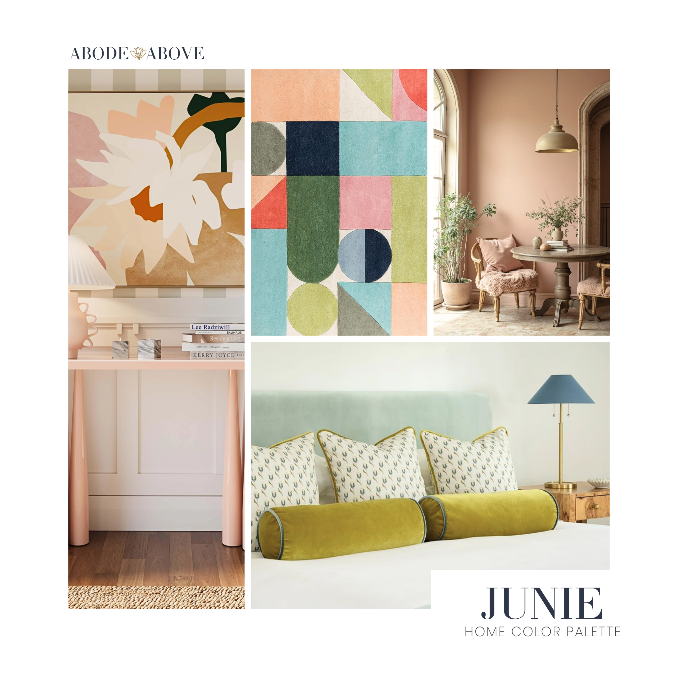
Junie was designed for the season when light lingers longer, colors feel softer but braver, and spaces are allowed to feel joyful without apology. This palette lives in that sweet spot between playful and pulled-together. It’s bold, but never loud. Pastel, but never precious. And it’s grounded enough to grow with you, whether you’re styling a nursery, a family room, or a sunlit kitchen that needs a little lift.
At its heart, Junie is inspired by two worlds that understand balance better than most: kids’ fashion and Scandinavian design. Children’s clothing does color fearlessly. It pairs unexpected hues without overthinking, trusting that joy is enough of a reason. Scandinavian interiors, on the other hand, know how to edit. They keep things airy, functional, and calm, even when color is present. Junie sits right between those two ideas, playful confidence and thoughtful restraint.
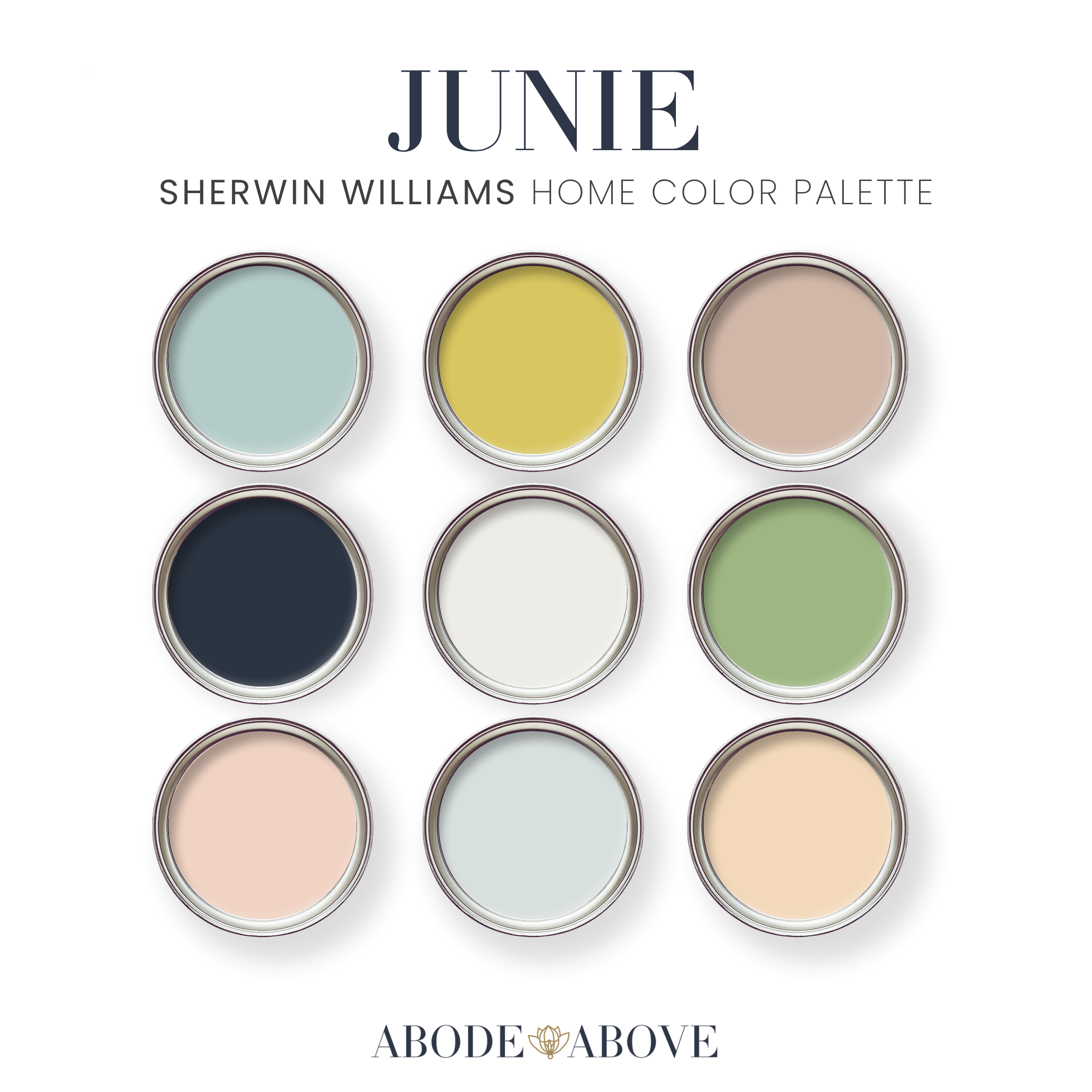
The Color Story Behind Junie
This palette is a mix of soft greens, buttery yellows, powdery blues, creamy whites, warm beiges, and one deep, grounding navy. That navy is important. It’s what keeps Junie from floating away. Think of it as the navy cardigan in a kid’s summer outfit, or the dark sole on an otherwise light sneaker. It adds structure.
The pastels here aren’t sugary. They lean earthy and muted, which makes them easier to live with and easier to layer. This is what allows Junie to feel summery without feeling seasonal-only. You can use these colors year-round if you balance them correctly.
And that’s the key word with this palette: balance.
How to Balance Bold Pastels Without Overdoing It
Junie works best when you don’t use everything at once. Just because the palette offers nine colors doesn’t mean you should try to squeeze them all into one room. Think in groups of two or three, anchored by one of the neutrals or the navy.
A good rule of thumb is this:
One soft neutral or white as your base
One pastel as your feature
One deeper or warmer tone to ground the space
That formula keeps the room feeling intentional instead of juvenile, even when the inspiration is playful.
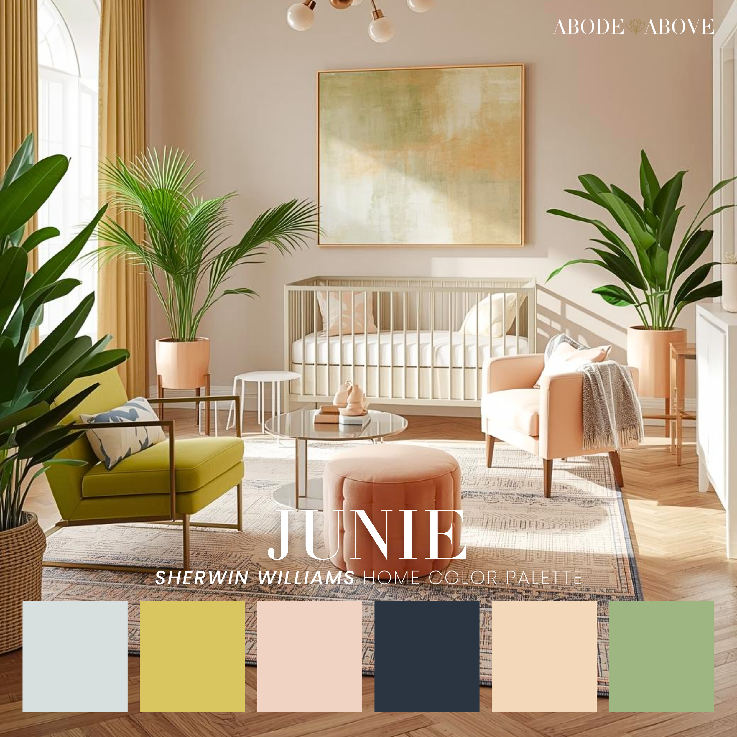
Combo Sample: Soft Green + Cream + Navy
Perfect for a Living Room, Playroom, or Shared Family Space
This is Junie at its most Scandinavian. Start with the creamy white as your wall color. It keeps everything bright and reflective, especially in spaces with natural light. Layer in the soft green through furniture or textiles, a sofa, an accent chair, or even built-ins if you’re feeling confident. Green is calming and grounding, which makes it ideal for high-traffic family spaces.
Bring in the navy sparingly but deliberately. Think picture frames, lighting, a coffee table base, or a striped rug detail. The navy adds maturity and contrast, making the room feel styled rather than themed.
This combination is especially good if you want a space that feels kid-friendly without screaming “kids live here.”
Why Junie Works Long-Term
Junie isn’t about trends. It’s about permission. Permission to use color softly. Permission to mix pastels without fear. Permission to design spaces that feel happy, functional, and real.
This palette grows with you. It works in kids’ spaces, but it doesn’t age out. It feels playful, but it’s still refined. And most importantly, it reminds us that color doesn’t have to be serious to be sophisticated.
Junie is for homes that want to feel lived-in, loved, and light-filled. And honestly, that’s always in style.