How Balanced Homes Still Feel Bold: The 70/30 Rule in Design
There’s a point in every design process where excitement quietly turns into hesitation.

You’ve committed to color. You’ve pinned the wallpaper. You’ve saved the sofa that makes your heart beat a little faster. And then, right before checkout, you pause and think, “Is this too much?”
Here’s the truth most people don’t hear enough: Bold design doesn’t fail because it’s bold. It fails when it has no support system. That’s where the 70/30 rule steps in; not as a rule you obey, but as a framework that keeps your home feeling intentional instead of impulsive.
At its simplest, the 70/30 rule says this: 70% of the space grounds you. 30% expresses you. But how that shows up in real homes is where things get interesting.
The 70%: The Unsung Hero of Every Good Room
The 70% is not the boring part of the room. It’s the dependable part. It’s what gives your eye somewhere to rest. It’s what allows your bolder choices to land instead of overwhelm. It’s the reason you can walk into a space and feel settled before you feel stimulated.
In practical terms, the 70% usually includes:
Wall color or color families that repeat
Flooring and large surfaces
Primary furniture pieces
Repeated finishes or materials
Visual rhythm and consistency
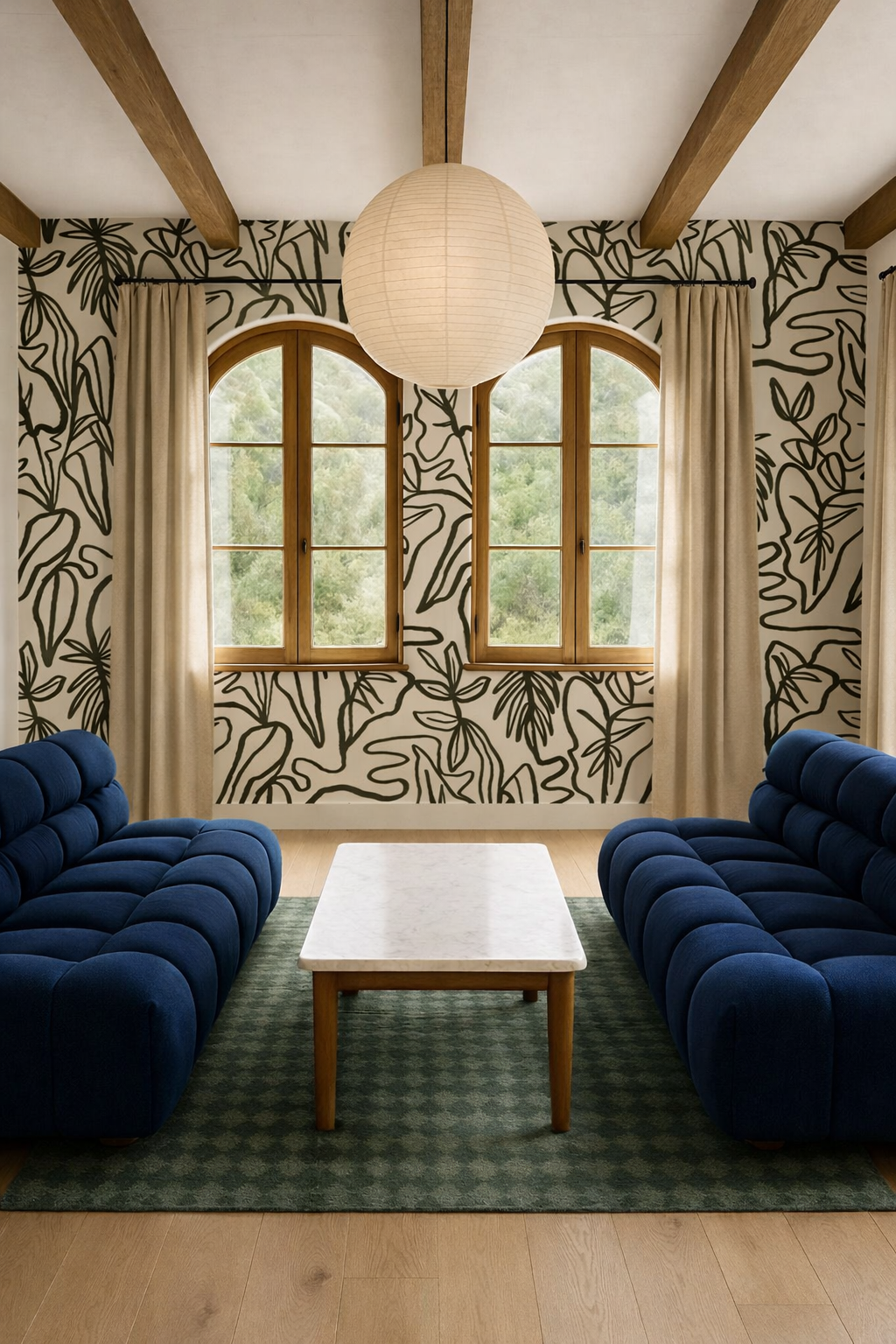
This doesn’t mean everything is beige or safe. It means everything is speaking the same language. For example, imagine a living room where the walls are painted a warm, creamy off-white with subtle undertones. The sofa is upholstered in a soft, textured neutral: camel, mushroom, warm gray. The floors are medium-tone oak. Metals lean warm and repeat across lighting and hardware.
Nothing here is screaming for attention. And that’s intentional. The 70% is doing the heavy lifting. It’s establishing mood. It’s setting the temperature of the room. It’s quietly saying, You’re welcome here.
Why Neutral Doesn’t Mean Forgettable
There’s a misconception that the grounding layer of a room has to be neutral to work. That’s not always true.
The 70% can absolutely include color, just controlled, consistent color. Think color-drenched rooms where the walls, trim, and even ceilings live in the same tonal family. Or a home where soft clay tones repeat from space to space, shifting slightly but staying related. Or a deep, moody palette where charcoal, inky blue, and warm black form the backbone.
The key isn’t the absence of color. It’s cohesion. When the majority of a room feels intentional and connected, your eye trusts the space. And when your eye trusts the space, it’s much more willing to follow you into bolder territory.
The 30%: Where the Room Finally Gets Personal
Now let’s talk about the part that makes people nervous… and excited.
The 30% is where your home stops being polite and starts being personal. This is where color gets saturated. Where pattern takes risks. Where texture shows up with intention. Where your taste, culture, humor, and confidence actually live.
The 30% often includes:
Accent walls or full wallpaper moments
Statement furniture
Art with scale and emotion
Bold textiles and layered materials
Unexpected color combinations
Sculptural lighting or architectural details
Here’s the part people miss: the 30% works best when it’s concentrated, not scattered. One strong moment almost always beats five half-hearted ones.
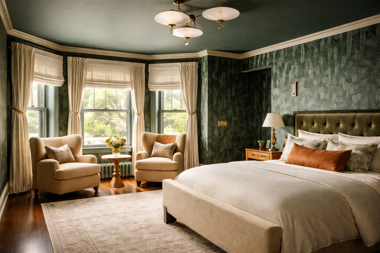
Bedrooms: Where the Balance Becomes Emotional
Bedrooms are deeply personal spaces, which is why the 70/30 rule feels almost magical here.
The 70% in a bedroom usually focuses on rest:
Walls in a cohesive tone or color wash
Bedding that layers neutrals or related hues
Furniture with clean lines and visual calm
Then the 30% steps in to add depth.
Maybe it’s a fully color-drenched wall behind the bed in a moody plum or indigo. Maybe it’s dramatic drapery in a saturated fabric that frames the windows like a stage. Maybe it’s oversized art that brings contrast and emotion. The result is a room that feels enveloping—not loud. Expressive, but still restful. This is where bold design often surprises people. When it’s supported, it actually makes spaces feel calmer, not busier.
When the Rule Breaks (And Why Rooms Feel “Off”)
Most rooms that feel overwhelming or unfinished aren’t missing decor. They’re missing hierarchy. Too many bold elements competing at once. Too many colors without a grounding story. Too many statement pieces with no supporting cast.
On the flip side, rooms that feel flat often have too much 70% and not enough 30%. Everything is calm, but nothing is memorable. The 70/30 rule isn’t about limiting you. It’s about giving boldness structure.
Color is one of the most powerful tools within this framework… and also one of the most misunderstood. The bold color doesn’t have to be everywhere. It just needs to be intentional. A deep green sofa in a neutral room. A clay-colored island in a light kitchen. A jewel-toned bathroom with soft, simple finishes.
When color lives within the 30%, it feels confident instead of chaotic.
How to Apply the Rule Without Overthinking It
You don’t need to count square footage or analyze every object.
Instead, ask: Does most of this room feel cohesive? Are the bold choices concentrated or scattered? Does the space have a clear visual hierarchy?
If the room knows what it’s about, you’re on the right track. Also worth saying plainly: bold doesn’t always mean bright. It can mean dark, moody, textural, graphic, or unexpected. Confidence shows up in many forms.
Where This Rule Becomes Yours
The 70/30 rule is not a template you copy. It’s a framework you interpret. Your 30% might be color, or it might be art. It might be pattern, texture, heritage, humor, or a story you want your home to tell. Two people can follow the same rule and end up with spaces that look nothing alike, and that’s exactly the point.
This is where having a designer in your corner makes all the difference. Because knowing the rule is one thing. Knowing how to bend it in a way that still feels cohesive is another. It’s the difference between a room that looks “well done” and one that feels deeply personal and effortless.
At Abode Above Interiors, this is how we approach every space. We help you identify what should live in the 70%—the elements that will ground your home for years to come. Then we work with you to define the 30% that actually reflects you: your taste, your energy, your lived experience, your comfort level with boldness.
The goal isn’t to make your home look like anyone else’s. It’s to make it feel like yours, just with clarity and confidence behind every choice. If you’re feeling stuck between playing it safe and going all in, this framework is often the bridge. And with the right guidance, it becomes less about rules and more about trust… trusting the process, trusting your instincts, and trusting that your home can be both calm and expressive at the same time.
Because when your space reflects who you are, balance stops feeling like a constraint, and starts feeling like freedom.