COOGI: A Love Letter to Bold Color, Rhythm, and Home
Some color palettes whisper. Coogi does not.
This one speaks in full sentences. It shows up layered, confident, and unapologetic. Coogi is a Sherwin-Williams home color palette rooted in richness, contrast, and cultural memory. It pulls directly from the visual language of the 1990s, a decade where color was worn loud, mixed freely, and used as both self-expression and armor. If you know, you know.
The name is intentional. Coogi immediately brings hip hop to mind. Heavy knits. Saturated color blocks. Texture you could feel from across the room. Artists like The Notorious B.I.G. didn’t just wear color. They owned it. In an era where Black creatives were carving space in music, fashion, and art, color became a form of authorship. It said “I’m here,” long before anyone asked permission.
That legacy matters. And it belongs in our homes.
Black culture has always been a cornerstone of bold color usage. Long before minimalism was repackaged as taste, color was layered into our environments as warmth, protection, celebration, and storytelling. You see it in Sunday suits, album covers, murals, quilts, hair, interiors, and music videos. Color was never an afterthought. It was the point.
Coogi honors that lineage.
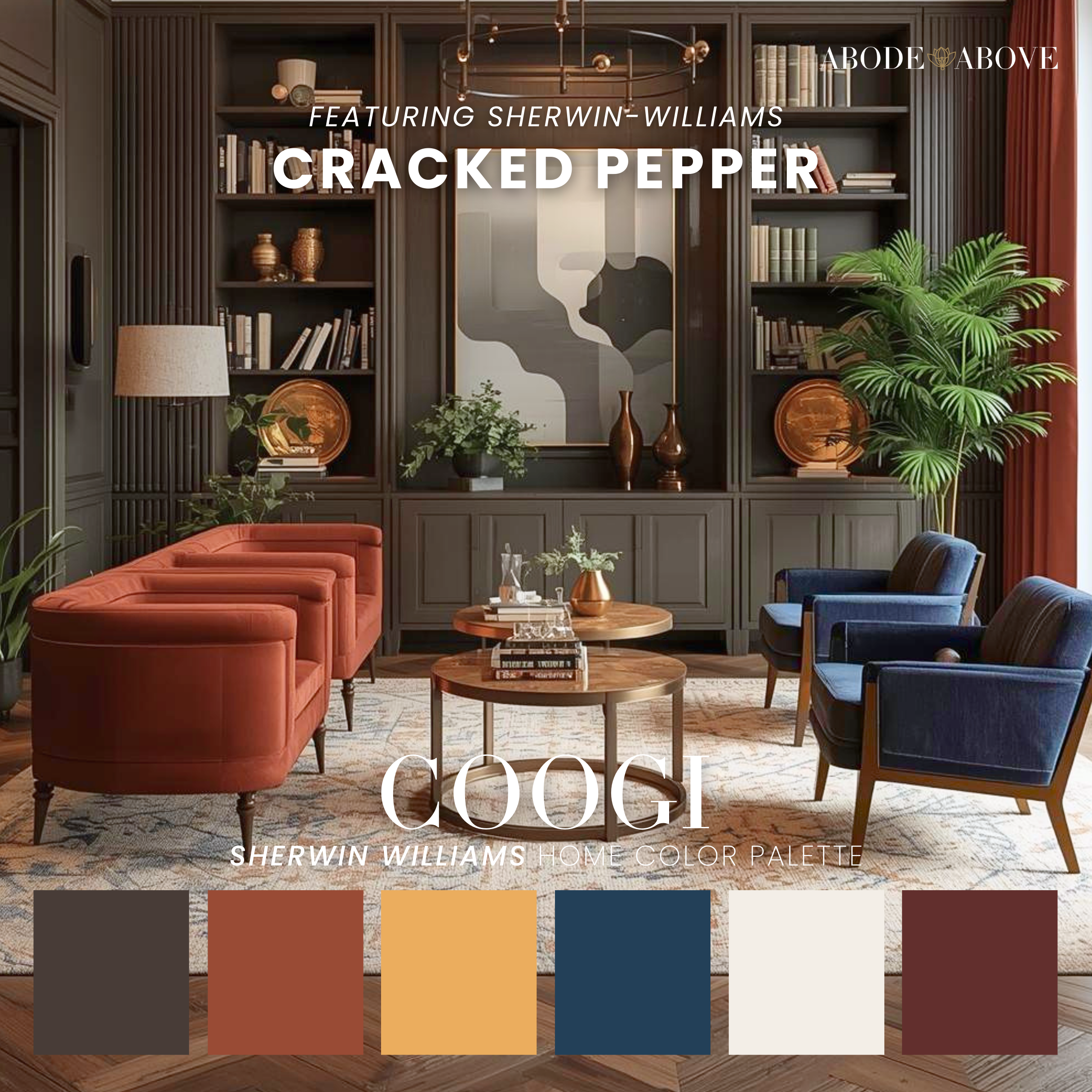
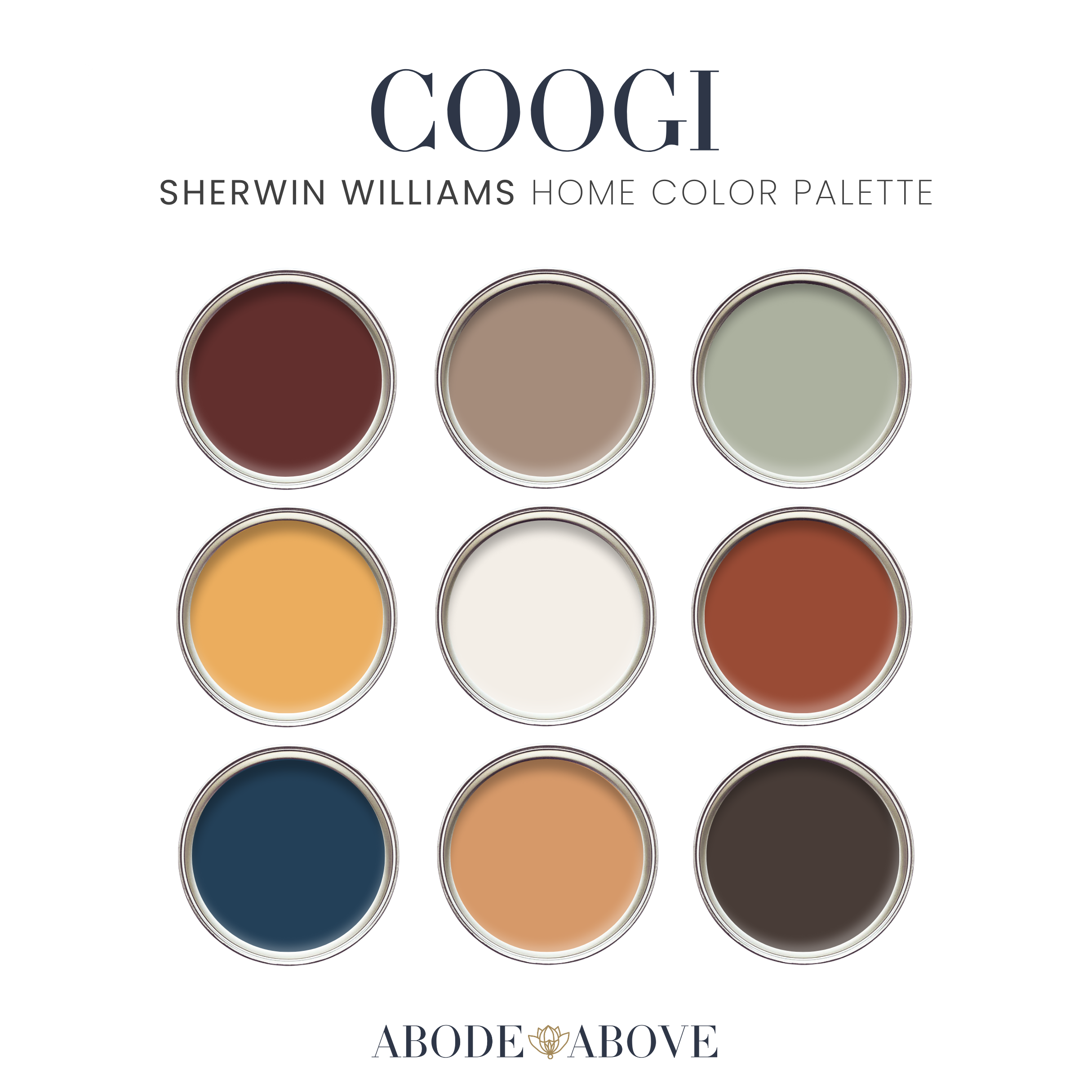
This palette blends deep browns, cracked pepper charcoal, camel warmth, burnished golds, creamy off-whites, rusted reds, and a grounded navy that anchors everything. These colors are not trendy. They’re enduring. They feel collected. Lived-in. Confident. They’re the kind of shades that look better with time, patina, and use.
At the heart of the palette is Sherwin-Williams Cracked Pepper. A modern charcoal that feels softer than black but just as commanding. It sets the tone. From there, the palette opens up into warmth and contrast. Creams that feel intentional, not sterile. Yellows that lean golden instead of pastel. Browns that feel luxurious rather than safe. And navy used the way it should be used. As depth, not decoration.
What makes Coogi special is not just the colors themselves, but how they interact. This palette is about combination. About trust. About letting colors sit next to each other without forcing them to match perfectly. That philosophy comes straight from 90s hip hop style. Nothing was overly curated, yet everything worked. Oversized silhouettes. Unexpected pairings. Texture on texture. Confidence did the heavy lifting.
That same energy applies here.
Understanding the Color Balance
This palette is bold, yes, but it’s also extremely disciplined. The colors are doing different jobs, and when you respect those roles, the space feels intentional instead of chaotic.
Coogi is built on a strong foundation-to-accent ratio.
Grounding tones: Cracked Pepper, deep charcoal, rich brown, and navy
These colors carry visual weight. They should anchor the room. Think walls, millwork, cabinetry, large furniture pieces, or architectural moments.Mid-range warmth: Camel, tan, rust, and golden ochre
These act as connectors. They soften the darker tones and keep the palette from skewing too heavy. These are your upholstery colors, wood finishes, rugs, and leather moments.Relief and contrast: Creamy off-white
This is not a background filler. It’s strategic breathing room. It keeps the palette elevated and prevents it from feeling closed in.
If you overload the space with the mid-range colors, the palette feels muddy. If you avoid the dark tones, you lose the soul. Balance is the difference between bold and overwhelming.
How to Implement Coogi Successfully
Example 1: A Library or Home Office
Start with Cracked Pepper or charcoal on the walls or built-ins. Let that color do the heavy lifting. Layer in camel leather seating, warm wood shelving, and brass accents. Use the cream shade on the ceiling or trim to lift the room. Add navy through art, books, or textiles. This space should feel cocooned, focused, and confident.
Example 2: A Living Room
Anchor the room with a dark element first. This could be a charcoal accent wall, navy sofa, or deep brown media unit. Then bring in warmth through a rust or golden-toned rug and accent chairs. Keep your walls cream if you want light, or go darker if you’re ready to commit. The key is contrast. Light walls need dark furniture. Dark walls need lighter upholstery.
Example 3: A Dining Room
This is where Coogi shines. Go bold on the walls with Cracked Pepper or deep brown. Pair it with a warm wood table, camel or rust dining chairs, and minimal cream accents in linens or art. Dining rooms can handle drama. This palette was built for it.
The Rule to Remember
Choose one dominant dark, one to two warm mids, and one light relief color per room. Everything else supports those choices.
Coogi isn’t about using every color everywhere. It’s about letting each color show up with purpose. When you do that, the space feels layered, cultural, and timeless, not trendy or loud.
That’s the difference between wearing color and owning it.

Coogi is for people who want their homes to feel expressive but grounded.
For those who are tired of playing it safe with beige-on-beige-on-beige, yet still want something elevated and timeless. This palette works beautifully in studies, libraries, dining rooms, lounges, and layered living spaces. It shines in millwork, built-ins, cabinetry, accent walls, and upholstery moments. It’s especially powerful when you commit to it instead of tiptoeing around it.
And let’s be honest. Color courage doesn’t come from nowhere. Many of us learned it from watching Black artists, designers, and tastemakers show us that boldness was not a flaw. It was the point. Coogi reflects that truth. It doesn’t dilute it. It doesn’t apologize for it.
Designing with Coogi means embracing that history while creating something personal. It’s not about recreating the 90s. It’s about carrying forward the confidence, creativity, and freedom that era embodied. The willingness to mix, layer, and trust your eye. The understanding that your home should feel like you, not a showroom. This palette invites you to stop asking whether a color is “too much” and start asking whether it tells the right story. Because the truth is simple. Homes with soul don’t come from playing small. They come from intention, memory, and a little bit of audacity.
Coogi is all of that. And then some.