Pantone’s Color of the Year 2026: What It Means, Why It Matters, and How to Push Back Against the Whitewashed Trend
Every year, Pantone announces a Color of the Year that sends a shockwave through creative industries: fashion, beauty, product design, advertising, and yes, interiors. That one hue becomes a cultural mood board. It reflects what we’re craving, what we’re avoiding, what we subconsciously need, and what we may not even realize we’re missing until it shows up on a pillow at HomeGoods.
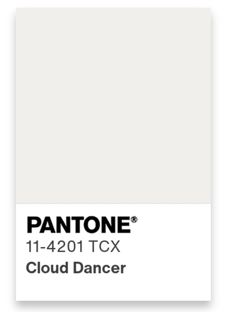
For 2026, Pantone has selected Cloud Dancer: a crisp, delicate shade of white that evokes linen drying in sunlight, soft plaster walls, and the promise of a clean slate.
But here’s the thing: this year’s choice hits differently.
Because color doesn’t show up in a vacuum, and neither do we.
And right now? In this American political climate that feels like everyone’s running on fumes, Cloud Dancer lands with a kind of… irony. A pure white “reset” shade in a year full of noise, tension, constant election chatter, and people just trying to keep their peace? It’s a complicated call.
So let’s talk about Pantone, what their choices actually influence, and why Cloud Dancer, no matter how pretty, deserves a little side-eye from those of us who know the emotional, cultural, and historical weight color can carry. Then I’ll walk you through how to bring intentional, joy-filled color back into your home, even while this white wave tries to pull you under.
What Pantone Really Does (and Why Everyone Follows Their Lead)
Pantone is the world’s color translator. They’re the reason a designer in New York and a manufacturer in Seoul can produce the exact same shade without ever speaking. Their color system creates consistency across: fashion, home goods, beauty packaging, branding, product design, printing, and advertising.
And when they announce a Color of the Year, the world listens. Not because we’re all blindly obedient, but because Pantone’s pick tells a story about what we want or need collectively, sometimes before we even realize it.
For Cloud Dancer, that story is “simplicity,” “freshness,” “neutrality,” and “quiet.”
Which… okay. I get it. We’re tired. We’re overwhelmed. A clean slate sounds nice in theory. But, it’s not that simple.

The color will soon be spotted everywhere

Cloud Dancer is Pantone's Colour of the Year for 2026
Why Cloud Dancer Is a Complicated Choice Right Now
Let’s speak plainly and from the heart for a moment.
1. This country is exhausted, and people need joy, not more emotional quieting.
Maximalism has been booming for a reason. Folks want color again. They want personality. They want rooms that feel like them after years of living through chaos and uncertainty.
White doesn’t give you that. It’s calm, yes. But it’s emotionally… empty.
And with everything going on politically, socially, economically? People need fullness.
2. An all-white aesthetic carries a certain history that isn’t neutral at all.
We’re not going to use the heavy word here, but we all know the vibe. Certain sterile, all-white environments have long been used to signal ideals that don’t make everyone feel welcome. Some imagery tied to “purity” aesthetics has been used to exclude, erase, or idealize certain groups over others.
So when Pantone says: “This is the global mood for the year.” …it hits differently if you understand the deeper layers.
3. Whitewashed rooms have been draining homes of life for over a decade.
Listen. I love a good white moment. White trim? Chic. Cloud-white kitchen cabinets with the right tile palette? Beautiful. But a whole home drowned in white? We’ve been there. We’ve done that. We’ve been stuck there.
People are craving soul again. Texture again. Warmth again. A little spice. A little personality. A little “this room makes me feel something.” Cloud Dancer as the color of the year only pushes people further into the safe zone, and that safe zone is exactly where too many homes go to lose their spark.
Why Embracing Color Is More Than a Trend, It’s Emotional Care
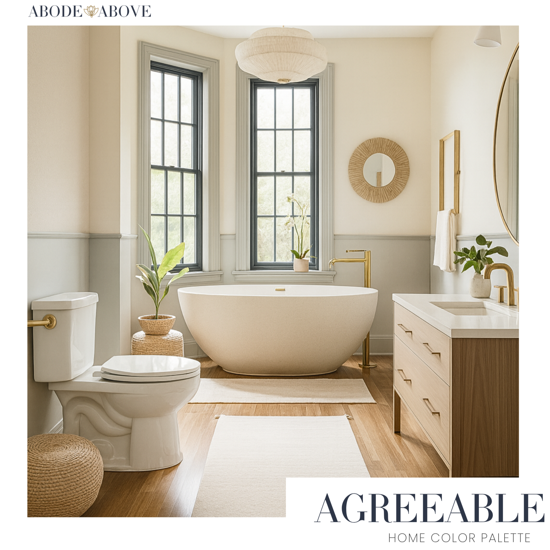
The Agreeable palette demonstrates how a refreshing soft white can support neutral shades.
Color isn’t just “pretty.”
Color holds your memories. Color speaks your personality. Color carries your culture. Color energizes or grounds you. Color can make your home feel like a hug, not a showroom.
When people choose expressive, emotive shades over plain white, they’re choosing:
joy
identity
comfort
storytelling
presence
And in a political climate where it feels like people are bracing for impact every single day? Your home is the one place that shouldn’t feel muted. Color helps people feel alive again. White can be a great supporting character, but it cannot carry the emotional load on its own.

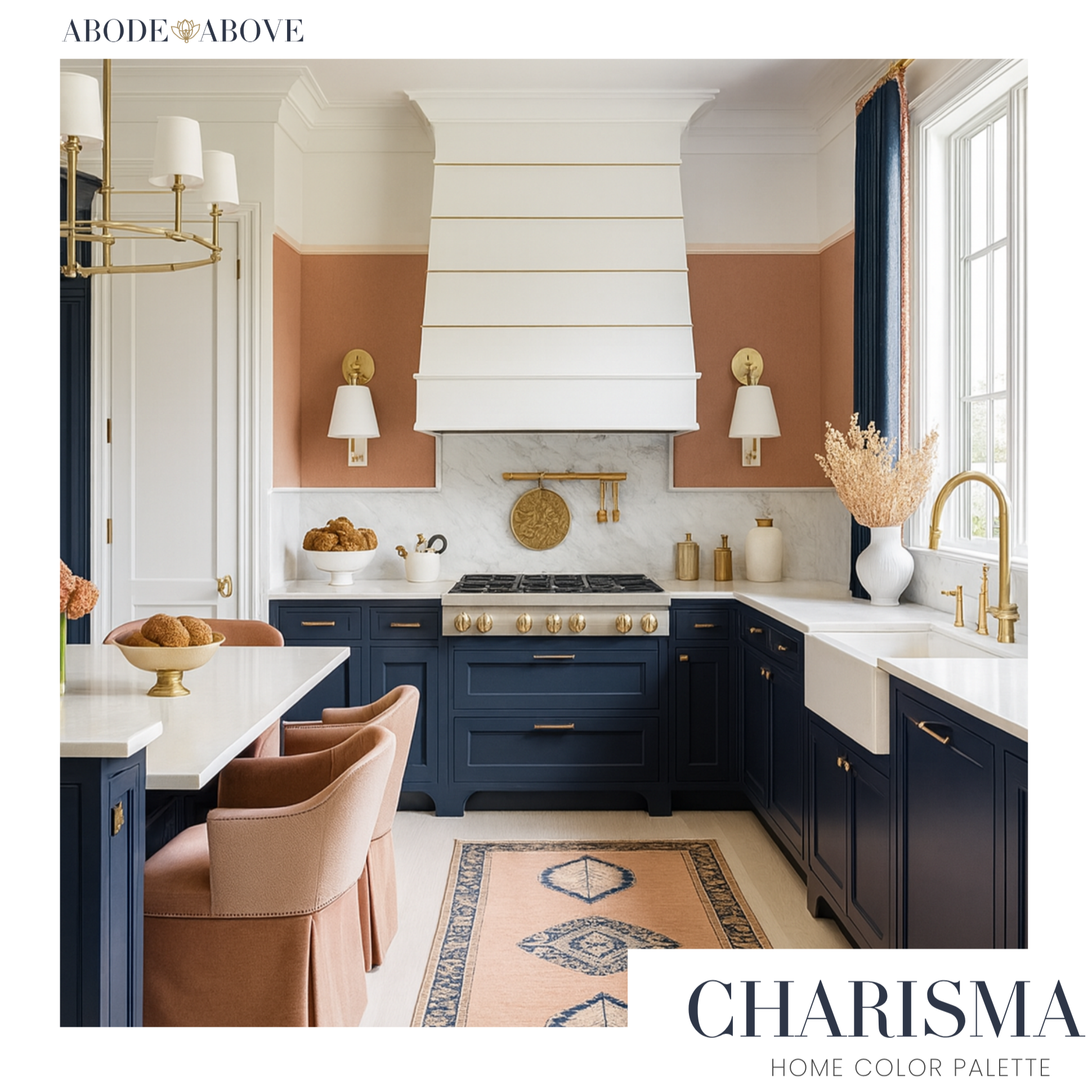
The Grace palette let’s this soft-white play the supporting role.
How to Resist the Trend (Without Throwing It Out Completely)
Cloud Dancer isn’t the villain here. It’s just a color that needs structure, rhythm, and intention. Think of it like a backup singer with a beautiful voice: incredible when harmonizing, but not meant to carry the entire album alone. Here’s how to use Cloud Dancer wisely while keeping your home expressive, layered, and emotionally nourishing.
Make Cloud Dancer Work With Color, Not Instead of It
This is where most people go wrong. They treat white like a default instead of a design decision. Cloud Dancer only shines when it’s supported by a palette that gives it purpose and contrast.
Here’s the step-by-step approach I recommend:
a. Start by identifying your emotional anchor color. Ask yourself: What mood do I want this home to hold? Warmth? Energy? Calm? Confidence? This one choice directs the entire palette.
b. Choose two expressive supporting shades that complement that anchor. These can be midtones, bold shades, or muted colors with depth: think olive, plum, rust, teal, cocoa, saffron, clay, slate.
c. THEN bring in a shade of white to frame, lift, or brighten those choices. White should highlight your color story, not erase it.
Use it where brightness feels helpful: trim, ceilings, cabinetry interiors, bedding layers, lampshades, or window frames.
d. Let your palette guide your décor choices, not the trend cycle. Your chosen colors should show up in textiles, upholstery, rugs, artwork, ceramics, and accent furniture. Cloud Dancer becomes the connective tissue, not the identity.
If you want guided palettes where this work is already done for you, this is exactly why my 9-Color Etsy palettes exist. Each one balances grounding neutrals, expressive midtones, and surprising accents. Each one makes shades of white feel intentional, and never isolated.
My Honest Take as a Designer (and as a person living through all this with you)
I’ll be real with you: Cloud Dancer makes sense for a world that’s grasping for a moment of calm. We’re tired. We’re overstimulated. Everything feels loud… politics, social divides, the pressure to keep up, the pressure to check out. A clean, quiet white like Cloud Dancer is the visual equivalent of taking a breath.
But here’s the part I need you to hear: a color that symbolizes “quiet” shouldn’t convince you to silence yourself in your own home.
Your space is where you get to speak the loudest. Where your identity, your history, your joy, your culture, your humor, your softness, your big dreams, your weird quirks.. all of it gets to live without apology.
Cloud Dancer can be part of that story. But it should never be the whole story.
Because when we strip our spaces down to only what feels “safe,” we unintentionally strip pieces of ourselves away too. And in a time when so many of us are feeling unseen, dismissed, or emotionally stretched thin by forces outside our control, it’s more important than ever to design homes that give something back.
Homes that feel like exhaling.
Homes that energize us when the news drains us.
Homes that hold our feelings instead of flattening them.
Homes that remind us that joy and beauty are not luxuries, they’re necessities.
And color is one of the most accessible ways to reclaim that joy. Rich hues, emotive tones, soulful palettes, they invite us to feel. To rest. To dream. To remember who we are when the world outside tries to tell us who we’re supposed to be.
So yes, be aware of context. Recognize the political, cultural, and emotional layers tied to a trend like Cloud Dancer. Understand that all-white aesthetics have histories and associations that might not sit comfortably with everyone. Let that awareness make you a more thoughtful, consumer. But don’t let the heaviness of the world take away the fun of this journey.
Designing your home, choosing colors, curating textures, playing with emotion is one of the few places where creativity and control are all yours. It’s one of the few corners of life where you can choose joy on purpose.
So, experiment. Play. Show off. Try the moody teal. Put the ochre sofa in your cart. Paint the ceiling the color you actually love. Layer on the textures that feel good under your hands. Let your home highlight your personality, not hide it.
Your home is not a trend report. It’s a lived-in autobiography. And the more intentional you are with your color choices, the more authentic that story becomes. If you ever need a guide, a palette, or a starting point, I’ve already designed collections that bring emotion, depth, and personality back into the process, because you deserve a home that reflects the fullness of your life, not the flatness of a cultural trend.
Now go color your world thoughtfully, joyfully, and with your whole heart.